Copper + Silk
Learn about Silk →A smooth, polished base that keeps the copper detail clean, crisp, and refined.
Starting at $85 · 250 cards
Shop this Combination →

Real warm metallic copper foil catches the light before your card is read. Built on substantial SilkCards stock, its reddish-bronze tone gives your logo, name, and signature details a warmer, more distinctive reason to be noticed, remembered, and kept.
A smooth, polished base that keeps the copper detail clean, crisp, and refined.
The soft matte surface makes copper appear sharper and warmer — the safest premium direction for most brands.
Dark stock gives the metallic layer maximum contrast and the most dramatic first read.
The side of the card becomes part of the impression — powerful for thick cards where the edge is visible in the stack.
A clear gloss counterpoint to the metallic copper — both shine and gloss working together on one card.
Best for brands that want the card shape itself to become part of the memory.
Real feedback from trusted professionals who expect more than ordinary business cards.
We’ve helped brands turn paper, foil, texture, and finish into confidence that makes stronger first impressions.
Get a sample kit and experience the shine, texture, weight, and finish for yourself.
Get guidance on the right combination of foil, stock, texture, and edge detail.
Grouped by how each foil behaves in light — 9 warm metallic foils across five finishes.
Most printers stop at gold and silver. We didn’t. A deeper range means your foil can match your brand exactly — not just approximate it — and it gives a designer room to make the card feel like yours.
With six finishes and 38 options, the foil can carry your actual brand color and character — warm, cool, jewel, or shifting — instead of defaulting to a generic gold.
A wider range lets foil do more than outline a logo. It can become the pattern, the texture, the focal point — whatever the card needs to be remembered.
Foil is hard to judge on a screen. Order a sample kit and feel how each look catches light in the hand before you commit.
Solid (15): Gold, Silver, Black, Rose Gold, New Penny Copper, Orange Copper, Red, Hot Pink, Light Pink, Lavender, Purple, Forest Green, Navy Blue, Ocean Blue, Teal.
Pearlescent (7): Gold Pearlescent, Silver Pearlescent, Red Pearlescent, Rose Gold Pearlescent, Hot Pink Pearlescent, Navy Blue Pearlescent, Green Pearlescent.
Rainbow (2): Rainbow Gold, Rainbow Silver.
Facet (7): Gold, Silver, Red, Hot Pink, Navy Blue, Green, Black.
Speckle (6): Gold, Silver, Red, Light Pink, Navy Blue, Green.
Holographic (1): Green Pattern 3.
“I cannot thank this company enough! My business cards are absolutely fabulous and I have received so many compliments on them. The pictures will not do them justice. I got the suede finish, 48 pt thick cards with silver foil on one side and the edges. They are so luxurious.”
Copper foil is for professionals and brands who want the warm metal to catch the light — and the moment — the instant the card changes hands.
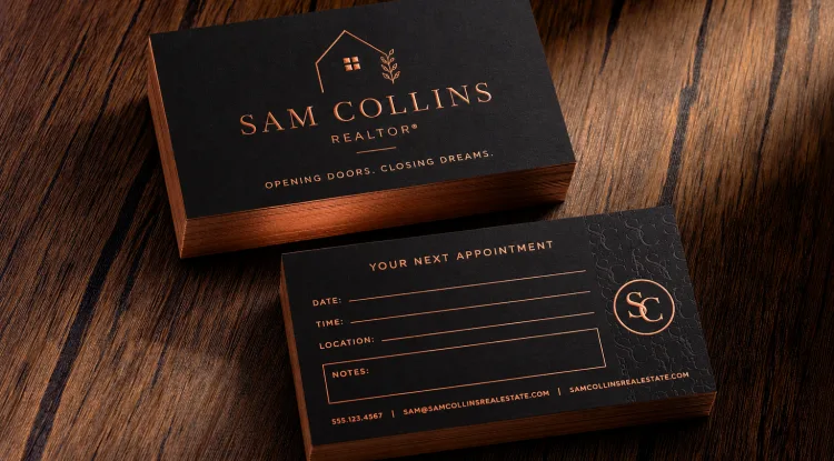
Remembered between the showing, the follow-up, and the close. A foil accent signals you take the work — and the client — seriously the moment the card changes hands.
See ideas for realtors →Your customer does not experience copper foil as a spec. They experience it as warmth. Light hits the detail, the card turns, and the brand feels more deliberate before the conversation even starts.
Copper is the warm, reddish-bronze foil signal — distinct from gold and rose gold, and easy to remember in the handoff.
The shine moves as the card turns. That movement is what separates metallic copper foil from a printed copper effect.
Copper on black or deep charcoal gives the strongest warm contrast and the most dramatic first read.
Choose the main copper detail, then decide how tactile, minimal, or dimensional the full card should become.
A SilkCards card becomes real in the hand — the weight, the copper foil, the texture. The sample kit puts the collection in front of you, and it ships free.
Bring your logo, rough idea, sketch, or brand direction and a SilkCards design consultant and designer will translate it into a copper foil business card that feels intentional, readable, and production-ready.
Keep Exploring
Foil you can feel — dimensional metallic detail that rises off the card.
Explore Raised FoilGlass-clear gloss without metallic color, for tone-on-tone shine.
Explore Spot UVRaised gloss that catches both light and fingertips.
Explore Raised Spot UV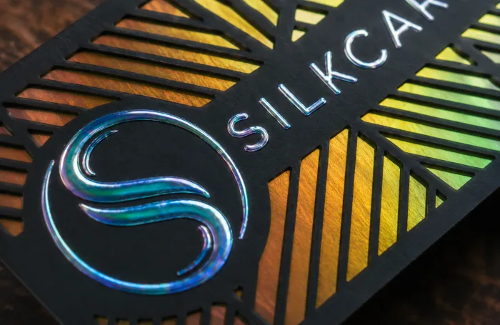
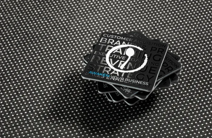
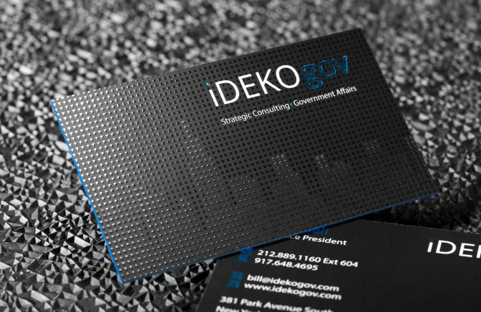
Most printers treat foil as a single accent on a thin card. We treat it as a material you can design with — in combination, and on stock most shops can’t foil at all.
A logo in mirror gold, a pattern in holographic, a detail cut in faceted silver — several foils can live on the same side of a single card. Foil stops being a highlight and becomes the whole illustration, the way a designer would actually build it.
Most printers can only foil thin stock, and the moment they go thick they switch to bare, uncoated paper that takes no finish at all. We build our thick cards from individually finished boards — so Silk and Suede lamination and full foil stay available straight through 32pt and 48pt. Premium weight, with the finish and the foil intact.
Foil works best when it has a clear job: highlight the logo, name, mark, border, or design detail people should notice first. From there, you can add texture, gloss, edge color, or thickness to make the whole card feel more complete.
✓ You want your logo, name, or mark to stand out immediately.
✓ You want copper, rose gold, gold, or specialty metallic detail.
✓ You want the card to feel polished, elevated, and memorable.
✓ You want one part of the design to become the focal point.
✓ You want a premium finish that works beautifully with silk, suede, embossing, Spot UV, or edge color.
Add glossy contrast against a silk or suede finish. Pair it with foil when you want both metallic shine and clear gloss working together.
Choose raised foil when you want your metallic detail to be seen and felt. It gives foil more dimension and touchable presence.
Carry the metallic finish through the side profile of the card for a more complete, finished look from every angle.
Add raised or pressed texture when your logo, mark, or design detail needs more physical depth.
Use suede when you want a soft-touch feel that makes the foil contrast feel richer and more tactile.
Use silk when you want a smooth, polished base that keeps foil detail clean, crisp, and refined.
Send us your logo and we’ll recommend the foil, stock, edge, and finish combination that gives your brand the strongest first impression.
Every finish has a different job. Here is how foil compares — and when another finish serves your design better.
| Finish | What it does | Best for | Buyer guidance |
|---|---|---|---|
| Copper Foil | Warm metallic copper shine applied to selected design areas. | Logos, marks, names, borders, luxury details. | Choose copper when you want warm, light-catching premium contrast. |
| Spot UV | Clear gloss applied to selected areas. | Subtle shine, tone-on-tone patterns, modern detail. | Choose Spot UV when you want gloss without metallic color. |
| Die Cut | Cuts the card into a custom shape, or cuts shapes through the face. | Silhouettes, brand shapes, cards that stand out in a stack. | Choose die cut when the shape of the card itself should be memorable. |
| Emboss | Raises part of the design above the card surface. | Logos, initials, symbols, tactile brand marks. | Pair with foil when the detail should be both seen and felt. |
| Cold Foil | Creates larger metallic artwork effects. | Full metallic visuals, gradients, photo-like foil effects. | Choose cold foil when the metallic effect is central to the entire design. |
Copper vs. bronze: copper reads brighter and redder; bronze sits a little deeper and browner. Both are warm metallic foils from the same hot-stamping process. If you searched for “bronze,” copper foil is almost certainly the warm tone you want — and we can match it before production.
Foil behaves differently on every stock. These are the materials where it performs best — and each one has its own page when you want to go deeper.
A smooth, polished base that keeps foil detail crisp and refined.
Soft-touch luxury that makes metallic contrast feel richer.
Deep black stock where gold, silver, and copper foil hit hardest.
Multi-board 32pt and 48pt weight with the finish and foil fully intact.
45pt letterpress cotton with a soft, tactile face foil loves.
Woven texture that gives foil a crafted, tailored feel.
Foil rewards restraint. These are the choices we steer customers away from — and what to do instead, so the finished card lands the way you imagined it.
Too much copper can make the card feel loud instead of premium.
Use copper on the logo, name, icon, border, or detail people should remember first.
Very small copper details may lose clarity depending on the artwork.
Copper performs best on confident, readable artwork with enough surface area.
Copper loses impact when it competes with too many visual elements.
Use contrast and spacing so the metallic detail feels intentional.
The essentials most buyers ask before choosing copper — short and to the point.
Copper foil business cards carry a real warm metallic copper layer — hot-pressed onto the card as a physical surface, not printed as ink. SilkCards applies it to the detail that should be remembered: a logo, name, monogram, border, or pattern. On 32pt+ stock and dark surfaces, the reddish-bronze shine catches and moves light the moment the card is handed over. We call that result the Warm Standard.
Substantial, high-contrast stock. Copper foil reads strongest on dark, matte, and Suede or Silk surfaces built on 32pt+ construction — the Silk Standard. Deep neutrals and dark stock give the warm metallic maximum contrast; thin glossy stock fights the foil, while a heavier matte card lets copper stand out as the deliberate detail it is.
They are close cousins. Copper reads brighter and redder; bronze sits a little deeper and browner — but both are warm metallic foils applied through the same hot foil-stamping process. If you have searched for bronze foil business cards, a copper foil is almost certainly the warm metallic you have in mind; send your artwork and we will match the tone you want.
Yes — the Free Sample Kit is the best first step. Photos show shine, but they cannot show weight, matte contrast, edge feel, or the way copper shifts as the card turns. Hold real metallic foil, stock thickness, and surface finishes in hand, then decide exactly what your own copper foil card should become.
Copper foil business cards carry a real warm metallic copper layer — hot-pressed onto the card as a physical surface, not printed as ink. SilkCards applies it to the detail that should be remembered: a logo, name, monogram, border, or pattern. On 32pt+ stock and dark surfaces, the reddish-bronze shine catches and moves light the moment the card is handed over. We call that result the Warm Standard.
They are close cousins. Copper reads brighter and redder; bronze sits a little deeper and browner — but both are warm metallic foils applied through the same hot foil-stamping process. If you have searched for bronze foil business cards, a copper foil is almost certainly the warm metallic you have in mind; send your artwork and we will match the tone you want.
No. Copper foil is a stable metallic-pigment foil film bonded to the card — not raw copper metal — so it will not tarnish, oxidize, or turn green over time the way uncoated copper can. The warm reddish tone you approve is the tone the card keeps.
All three are real metallic foils; the difference is tone. Copper is warm and earthy — a reddish-bronze. Gold reads yellow and classic. Rose gold is a soft pink-tinged gold. Copper is the choice when you want a metallic that feels warm and distinctive rather than traditional.
Substantial, high-contrast stock. Copper foil reads strongest on dark, matte, and Suede or Silk surfaces built on 32pt+ construction — the Silk Standard. Deep neutrals and dark stock give the warm metallic maximum contrast; thin glossy stock fights the foil, while a heavier matte card lets copper stand out as the deliberate detail it is.
Yes. Copper foil pairs with embossing, debossing, Spot UV, and edge finishes — the multi-finish freedom that lets one card feel built rather than printed. Embossing makes the copper felt as well as seen; Spot UV adds a clear gloss counterpoint; a copper or color edge finishes the third side.
Real foil. Copper foil is a physical metallic layer pressed onto the card with heat and a die, so it reflects and shifts light as the card turns. Printed copper ink is flat pigment that only mimics the color. For a logo or name meant to be noticed in the hand, real foil is what earns the second look.
Yes — the Free Sample Kit is the best first step. Photos show shine, but they cannot show weight, matte contrast, edge feel, or the way copper shifts as the card turns. Hold real metallic foil, stock thickness, and surface finishes in hand, then decide exactly what your own copper foil card should become.