Real estate is tough. In this industry with serious competition and the massive amounts of networking required, it’s important to convey a lasting impression to clients and other professionals. Is your business card working for you? Take a leaf from the playbooks of the agents below who have really made their cards their own brand advocates.
These Real Estate Business Cards Make an Impression
How well does your business card match up?
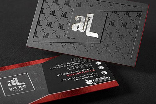
1. Art Lee Real Estate Team

This card is a complex blend with two different foil colors, die-cut layering, colored edges, and a spot UV print in the background. If the shiny look and unique shape doesn’t catch a client’s eye, nothing will.
2. Kevin J. Colman
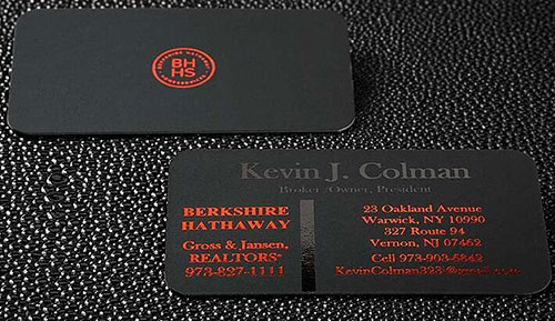
Spot UV and a reddish foil atop suede Onyx stock, this card is just as visual as it is tactile. As soon as you hand one of these puppies over, the immediate reaction is to the smooth velvety texture of the card.
Related: 5 Simple Tenets of Memorable Business Card Design
3. Century 21
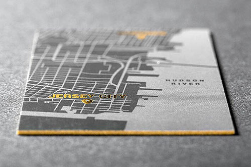
This Centure 21 card is SUPER creative. With a Google Maps-style print on one side, implying that the agent serves and has knowledge of this specific area, and a grabbing gold foil stark against a gray background, it sends its message loud and clear.
4. Eve Holder Homes
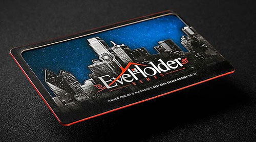
This die-cut business card uses layering at its finest. The cityscape over the “starry” background of sparkles inspires a positive view of the area as well as a unique impression for the agent wielding this card.
5. Gale
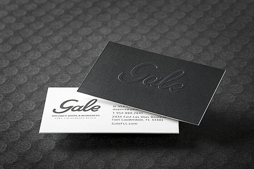
While a lot of individuals in the real estate niche tend to go for flashy, look how well-executed this minimalist design is! The raised lettering on the subtly textured gray is superb, and the text on the opposite side is clean and easy to read. This card actually pulls off the plain white edge phenomenally.
6. KG Property Management
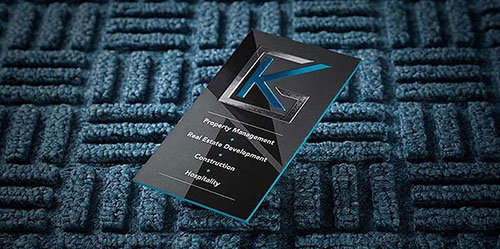
Two kinds of foil enhance the geometric logo design, and the colored edge only furthers the contrast between the turquoise and gray. The services offered are succinct and to the point.
7. Gold Coast Luxe – Luxury Real Estate
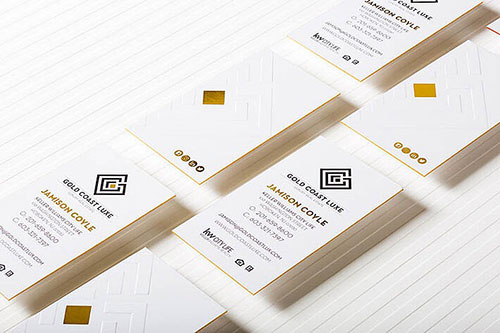
This card has it all: gold foil, colored edges, and an embossed design. The minimalism on one side emphasizes this company’s dedication to social media, which is a good sign that they like to stay connected to their customers. The gold foil printing on these business cards gives them an added “luxury” feel.
8. Joseph J Zanzuri
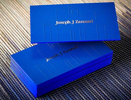
The extreme blue and matching colored edge makes this business card really pop. Add that to the subtle foiling of his name along with the spot UV geometrical cityscape, this card gives the impression that its owner is bold, an asset in real estate.
Related: Survival Guide: Steps Every New Real Estate Agent Should Take Immediately
9. Radke Agency & Associates
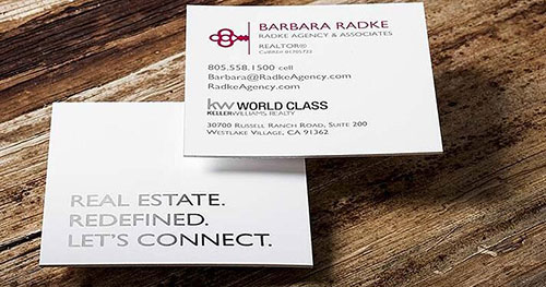
FINALLY, we get to a square business card. This unique shape stands out in a stack of business cards and also gives pause when it’s first handed over. The white space as well as the subtle foil on the catch phrase makes for a great clean design.
10. Lisa Patton
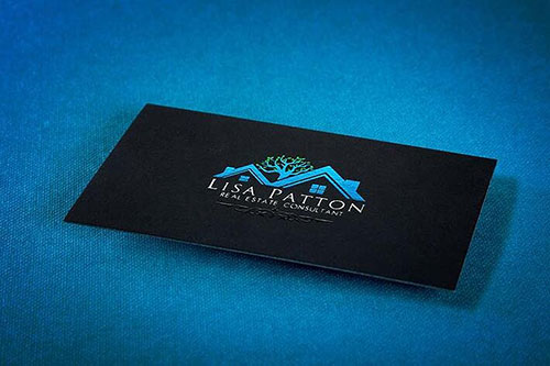
Can’t say enough about this card. Simple, elegant, and beautifully designed. With a turquoise and a green foiling and a spot UV design below the name, the logo stands out stark against the Onyx stock.
11. The Louie Ortiz Group
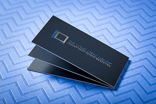
This card says one thing: “Professional.” The stark minimalist design with raised foil and sans serif font gives a respectable tone that makes you think that this guy means business.
Related: How Typography Can Influence the Behavior of Your Audience
12. Love Central Florida
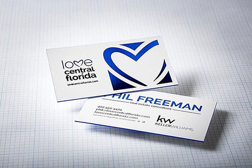
The name and the swooshing heart logo is meant to signify that you should always love where you live, and a real estate agent will make that happen. The dark blue foil works well with the colored edge, and this is an example of the RIGHT way to do a white card.
13. Mark Jacobs & Assoc.
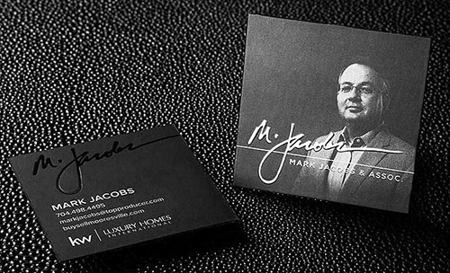
One question that we always seem to run into is whether it’s tacky to include a photo on a real estate agent’s business card. But including a photo doesn’t make a business card cheesy; it’s HOW you include a photo. And this square card on Onyx does it well.
Related: 5 Ways to Stand Out from Other Real Estate Agents
14. Realty One Group
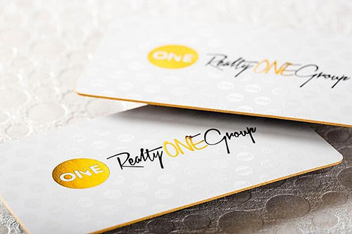
With a trendy script font coupled with colored rounded edges and two well-placed areas of gold foil, this business card screams class and luxury.
15. Patrick W. Woods
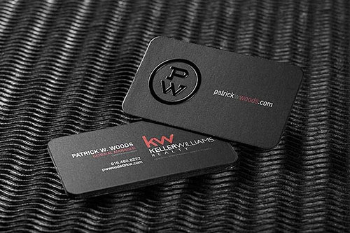
The foundation of this card is its Onyx stock and rounded edges, but that isn’t what makes this card special. Look at that amazing raised monogram, giving this business card a shiny and tactile element.
Related: Are Unique Tactile Business Cards the New Norm?
16. Savannah Real Estate Company
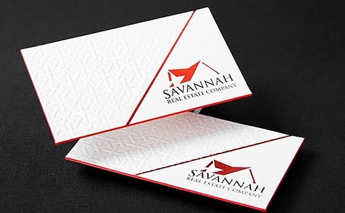
We love this card for its excellent use of cotton stock and a tiled letterpress texture. It wouldn’t be as impressive without that bold red edge, either.
17. The Alcove Group
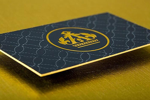
Here, we have an inked letterpress with a gold foiling, making this business card both visually and texturally interesting. The crown-like design of the logo in addition to the gold gives a feeling of prestige and excellence.
Related: Luxury Marketing Techniques for Luxury Real Estate Agents
18. Rise Property Solutions
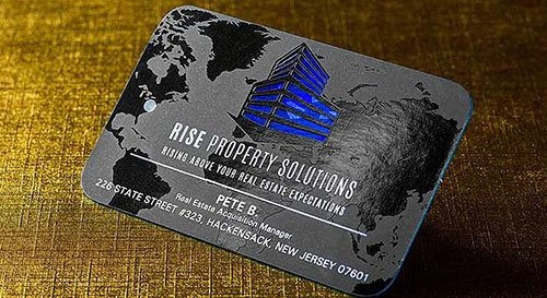
This card here illustrates that Rise has no bounds with the gorgeous Spot UV map in the background and the rounded corners that make it seem almost globe-like yet still square. The blue die-cut layer beneath draws the eye as the focal point.
19. Remax
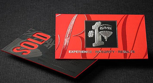
The smooth, thick suede stock sets a tone of luxury not likely to be forgotten while the die-cut “SOLD” makes a bold statement. Add that to the Spot UV and foil, and you have one stunning card.
20. Mo Jaber
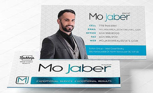
This is another card that does the agent’s photo quite well. His professional appearance placed over the turquoise bar says who he is while the turquoise foil adds a visually interesting element to the design.
21. The Joy of Real Estate
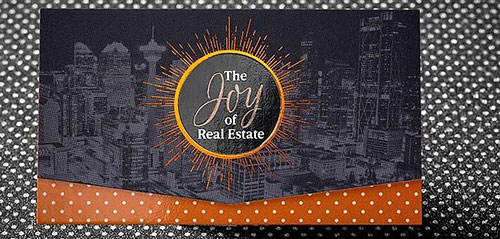
This card speaks to the excitement of purchasing a new home rather than the business side. The gorgeous sunburst in the center radiates warmth over the cityscape, aided by the whimsical polka dot design below the die-cut top layer. A bit of Spot UV makes the suburst stand out both visually and in a tactile way.
22. Fuse Realty
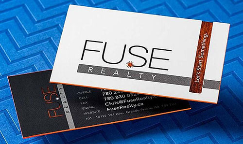
This amazing logo uses the S as a spark, and the orange colored edges and orange foil further emphasize the idea of lighting a match to “Start Something” as their company tagline suggests.
Did you like what you just saw? Or are you the kind that needs solid proof? No worries! Get a FREE sample pack and experience the SILKCARDS difference.