

From the spring of 1980 award-winning documentarian, Errol Morris started to conduct tests on the effects of fonts on audience behavior. One of the most critical studies that he did involved Canadian student Phil Renaud.
Phil wrote 52 essays 18 of which were in Trebuchet, 11 were set in Times New Romans while 23 were written in Georgia. The Trebuchet essay scored a B-. Times New Roman essay scored an A- while the Georgia font articles scored straight As. This was among the first demonstrable effects of fonts on audience perception, judgment, and influence.
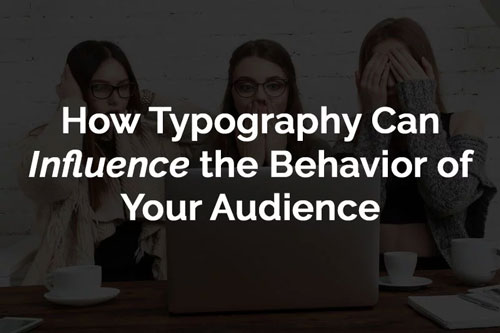
How Font Affects Reading
When it comes to reading, fonts are one of the most critical aspects that determine how well the readers will get to the bottom of the page. The consensus is that readers often read 28% of the words in a typical text. On average they read only 20% of the text on a page.
There are four essential aspects to a font. These are the size of the font, line spacing, the age of the reader, and intensity of the font. When it comes to reading online, small font sizes and low contrast fonts are the number one complaint by users. Keep in mind that the amount of light that reaches your retina drops by 50% by the time you hit age forty and drops to a mere 20% by age sixty.
Read: What’s the Difference Between Typeface and Font
Font Psychology
Fonts often have a corresponding associative emotion. When people read logos, essay or articles they tend to absorb the overall image design of the font rather than individual words. That’s why companies like Disney have used an intricate font to produce such a recognizable logo. This is what makes it possible to create personality using fonts.
Some of the basic tenets of font psychology encompass serif, sans serif, script, display, modern, decorative, etc.
Fonts can build trust, affect senses, project objectivity as well as create a fun feeling.
Choosing the Right Font
There are five important principles that determine how you choose fonts for your branding.
When selecting fonts, make sure they fit with the nature of the information being portrayed. Some fonts befit each and every imaginable situation.
When grouping fonts, keep in mind how each letter fits with the rest. There are geometric sans, humanist sans, old style, transition & modern, as well as slab serif.
The third principle is design while the fourth principle is overall display. The last one important principle that determines font selection is creative inventiveness.
Read: When Is It Acceptable to Use a Script Font in a Design?
Invoke Personality Through Emotive Typography
Every typography display that you choose either adds or subtracts from your personality. That’s why you have to invest in typography that best reflects your personality.
Make sure you are authentic, clear, humanized, diverse and consistent. Make sure you strike a balance between emotions, aesthetics, realism and abstraction. The color, design, flow and contrasts should all accentuate each other in the overall layout.
Using Font to Effect Conversions
Fonts tend to have a subtle yet powerful impact on conversions. This is critical especially if you are using fonts in places where there are long reads like a blog post.
Fonts tend to have assigned meaning based on origin, common use or the effect of its personal moods and emotions. In this regard, Helectiva and Georgia tend to be the most liked fonts.
As you consider enahncing the design for your branding materials, consider font options that represent your brand and evokes emotions among your clients and/or audience.