Embed this infographic on your website
Theory of Color Infographic [Summary]
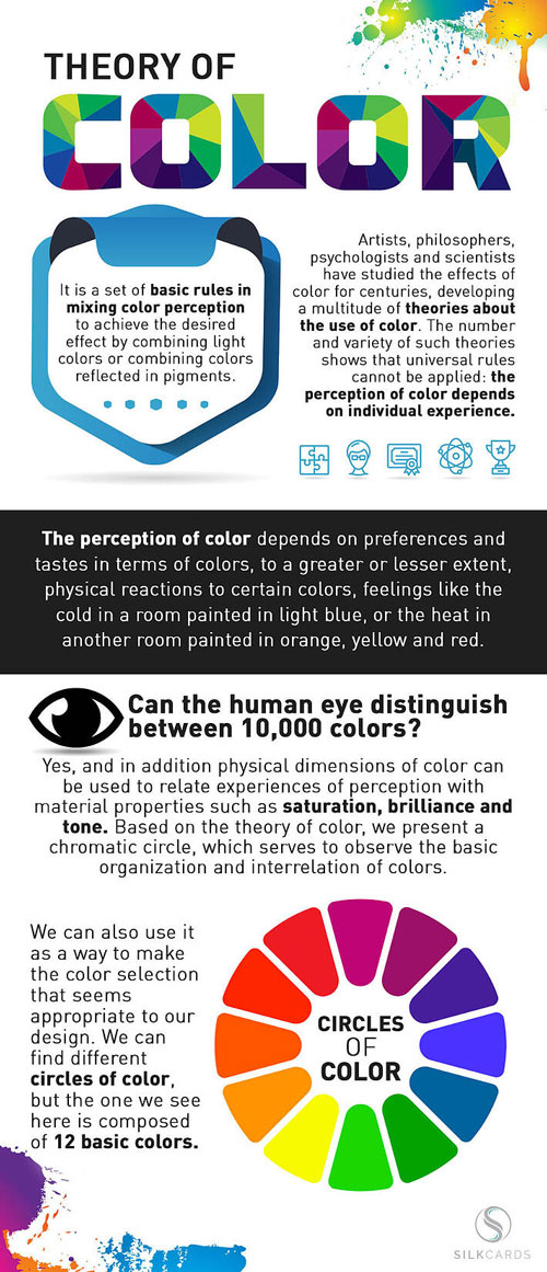
Artists, philosophers, psychologists and scientists have studied the effects of color for centuries, developing a multitude of theories about the use of color. Whether online in a website or within custom die cut business cards, the number and variety of such theories shows that universal rules cannot be applied: the perception of color depends on individual experience.
Color Theory Definition
A set of basic rules in mixing color perception to achieve the desired effect by combining light colors or combining colors reflected in pigments.
Color theory definition: The perception of color depends on preferences and tastes in terms of colors, to a greater or lesser extent, physical reactions to certain colors, feelings like the cold in a room painted in light blue, or the heat in another room painted in orange, yellow and red.
Most Visible Color to the Human Eye
Can the human eye distinguish between 10,000 colors? Yes, and in addition physical dimensions of color can be used to relate experiences of perception with material properties such as saturation, brilliance and tone. Based on the theory of color, we present a chromatic circle, which serves to observe the basic organization and interrelation of colors.
Color Contrast Wheel
We can also use it as a way to make the color selection that seems appropriate to our design. We can find different circles of color, but the one we see here is comprised of 12 basic colors.
Contrasting and Complementary Colors Infographic [Summary]
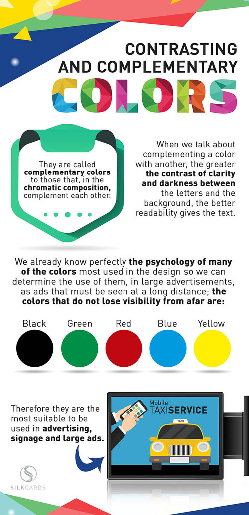
When we talk about complementing a color with another, the greater the contrast of clarity and darkness between the letters and the background, the better readability gives the text.
They are called complementary colors to those that, in the chromatic composition, complement each other.
Easiest Colors to See
We already know perfectly the psychology of many of the colors most used in the design so we can determine the use of them in large advertisements, as ads that must be seen at a long distance: the colors that do not lose visibility from afar are:
- Black
- Green
- Red
- Blue
- Yellow
Therefore they are the most suitable to be used in advertising, signage and large ads.
Color Combinations: Background and Text Infographic [Summary]
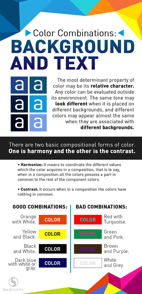
The most determinant property of color may be its relative character. Any color can be evaluated outside its environment. The same tone may look different when it is placed on different backgrounds, and different colors may appear almost the same when they are associated with different backgrounds.
There are two basic compositional forms of color. One is harmony, and the other is the contrast.
Harmonize: It means to coordinate the different values which the color acquires in a composition. That is to say, when in a composition all the colors possess a part in common to the rest of the component colors.
Contrast: It occurs when in a composition the colors have nothing in common.
Background and Text Color Combinations
Good combinations:
- Orange and white
- Yellow and black
- Black and white
- Dark blue with white or gray
Bad combinations
- Red with turquoise
- Green and pink
- Brown and purple
- White and gray
Related: Branding Design: What’s Current, What Works, & What Doesn’t
Ready to put your newfound color theory knowledge to the test? Start building your brand with SILKCARDS, where we offer premium business cards and other marketing materials. Get your FREE sample pack today to check out what we’re all about.

