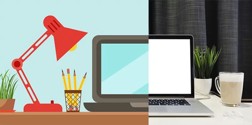
Variety is the spice of life. After all, it would be sad if we all had to eat stir fry for every meal. Customers love a variety of products and services to choose from, too. There is one thing about your business that you want to be uniform, though. Your brand design should be consistent: your design needs to enhance your brand’s identity, not detract from it. Your customers should be able to easily recognize your brand from the crowd.
Flat Design vs Realism
One of the first steps to developing a consistent design is to decide what design style is right for your brand. Should you go with a flat design or realism? Let’s take a look at realism first.
What Is Realism?
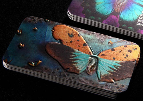
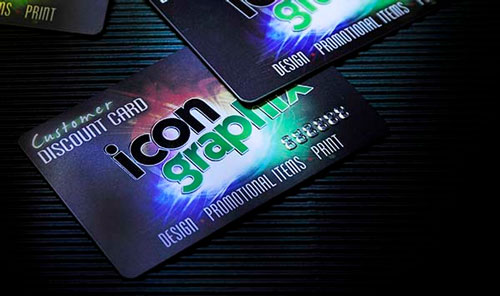
Material design is on the other design extreme compared to flat design. It is intentionally meant to be complex and “realistic” and utilizes a number of common characteristics towards that end goal. Here are a few common aspects of realism.
- Shadow and lighting to create depth
- A more three-dimensional feel
- Can use complex color systems and gradients
- Spans from photo-realism to detailed 3-D illustration
- Takes the z-axis into account
Related: Brand Collateral Design Tips that Effectively Promote Your Business
What Are the Merits of Realism?
When web design first began and up until recent years, material design was the chief means of web design. It just made sense to make things appear like the real world. Although flat design is quickly gaining notoriety over material design, there will always be some need for it.
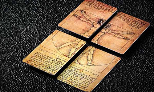
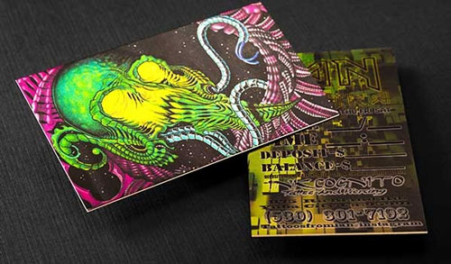
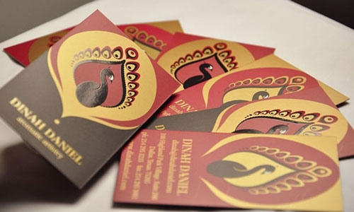
Realism Design Examples
What Is Flat Design?
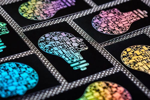
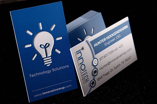
A flat design uses none of the complex components that realism does. Because it is basic, the design does not utilize creative means that would make it appear to be three dimensional. Here are a few common characteristics of this design.
- Does not use drop shadows
- No textures or gradients
- Simple text
- Flat colors
- Completely two-dimensional
Related: Branding Design: What’s Current, What Works, and What Doesn’t
When Is Flat Design a Good Choice?
More and more companies with a heavy online presence are going to flat designs. They do a better job of scaling down on mobile devices without appearing jumbled. Flat designs also require less coding. This results in a site with more speed. Those looking for ways to simplify their sites for customers also appreciate a flat design.
Related: Types of Logos: Choosing a Logo That Appeals to the Masses
The more your business is tied in to the web, the more you may want to consider flat design. Not only will your brand be easier to distinguish, but your customers will find your website to be more straight-forward and efficient.
Many believe that flat design will be the predominant design choice of the future. It can make the web easier to use and scan while still maintaining visually attractive qualities.
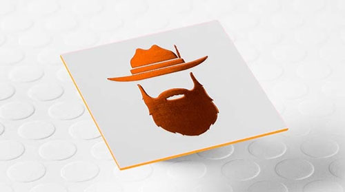
Flat Design Examples
What’s the Difference Between Flat Design and Minimalism?
Minimalism is a philosophy of design that runs on the idea that less is more when it comes to design. Features, colors and fonts that do not help to meet a specific goal or objective are eliminated. Flat design can be combined with minimalism to create a site with the bare minimum needed, but they aren’t mutually exclusive. Flat design can have more features than it needs to function even though its design is simple and not utilize minimalism. Similarly, minimalism can have photographic and realistic elements instead.
What’s the Difference Between Flat Design and Material Design?
Material design and flat design tend to look very similar. However, material design is, in a sense, a methodology that originated from Google. However, when using material design principles, it is not necessary to attribute the style to them. When making the distinction, keep these things in mind:
- While material design is primarily flat in color, it can be multidimensional unlike flat design.
- Material design is more of an evolution of flat design in an attempt to be more realistic.
- Material design is a tad more versatile.
How to Choose the Design Style for Your Brand Identity?
In conclusion, if you want to go the way that most businesses are going these days, you should look into a flat design. It is generally more user friendly, still maintains aesthetic value and helps website speed. That being said, material design will never completely disappear though it likely will play a lesser role in the future. Your business may be one of the unique cases where material design works better or, at least, does not hinder your business goals.
Keep in mind that whatever you choose, your implementation should be consistent throughout your website and branding. If you need a partner in the design world to help you bring your printed marketing materials to life, our high-impact custom design here at SILKCARDS can take your brand from conceptualization to reality.

