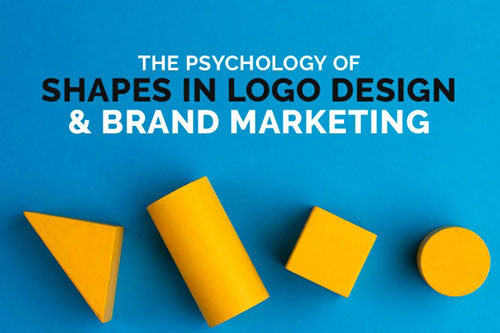
We often pay attention to font and colors when building a logo or a brand, but shape is just as important as any other design element. Like color and typeface, different shapes can evoke a wide range of emotions. Choosing the right shapes can help your logo and marketing efforts better resonate with potential customers.
Take a peak now → See how your business cards can take a shape all of its own with FREE SILKCARDS sample pack.
While there are endless variations, almost every logo utilizes a few basic shapes. Once you learn about the different moods and emotions associated with each one, you make the right decisions for your own designs.
The Impact of Shapes in Marketing a Business
Shapes can succinctly convey the essence of your company by suggesting movement, pleasure, creativity, calmness, or a host of other qualities. Shape can also provide unity to your logo, especially if it utilizes gestalt design principles. Once you learn about the emotions commonly associated with different shapes, you can begin to use psychology to improve your branding and marketing efforts.
The 3 Types of Shapes
- Natural/Organic: Logos which take advantage of natural shapes can pique the interest of customers, while also invoking a sense of calm. Whole Foods and a wide array of heath companies have adopted this style in recent years.
- Abstract: An abstract logo cleverly represents some part of your company in an artistic way. Apple and the World Wildlife Fund are only two of the most famous examples of this style.
- Geometric: Geometric logos emphasize logic, rationality, efficiency, and exclusivity. They have been adopted by tech companies like Google as well as luxury companies like Givenchy.
The Psychology of the 7 Most Popular Geometric Shapes Used in Logo Design
1. Circles
Circles, ovals, ring, or ellipses are often related to community, relationships, unity or harmony. They can signify love and friendship or partnership and stability. They are ideal for organizations which want to emphasize their reliability or the sense of community they foster among customers. As a result, round shapes generally convey positive emotions to viewers.
Pepsi, General Electric, and several car companies use round shapes in their logos.
2. Squares
Squares and rectangles tend to be associated with stability, pragmatism, efficiency and professionalism. They also evoke a sense of trust and power, and can be used to emphasize a company’s focus on order. However, some organizations are wary of alienating potential customers by appearing to be cold or distant, and may tilt their logo at an angle to signal a sense of fun. American Express, Lego and Domino’s take advantage of squares and rectangles to emphasize these qualities.
3. Triangles
Triangles have come to be associated with balance, rationality and creativity. They can also easily convey a sense of balance, direction and dynamism. They share some attributes with squares and rectangles, including efficiency and power. Triangles are commonly associated with law, mathematics and science, but also with religion. Mitsubishi, Citgo, Google and Delta have all included triangles in their logos.
4. Crosses
Vertical and horizontal lines each tend to be associated with their own sets of emotions. Vertical lines tend evoke a sense of power, strength and individuality. They are often associated with characteristics typically associated with masculinity, such as aggression. Horizontal lines can convey a sense of community are associated with traits often considered to be feminine, such as calmness or peacefulness.
5. Spirals
Spirals take advantage of the emotions associated with curves and circles, but bring their own fun twist to them. They are often associated with creativity or growth, and can convey a intelligent, whimsy, or adventurousness. Spirals are often used by educational, medical or tech companies, including Sun Microsystems. They are also notably used in the travel industry, including by Hilton Hotels & Resorts.
6. Straight Lines
Straight lines can give your logo a bold, energetic and daring appearance, and are associated with a wide range of traits typically considered to be masculine. Monster Energy integrated straight lines into their typeface to bring energy and aggression to their brand.
7. Curves
Curves evoke traits similar to those of circles and ellipses, and are often associated with femininity. They can also suggest motion or pleasure, and are used by brands as varied as Coca-Cola and Nike. Disney famously integrated curves into their typeface to give a family-friendly appearance.
Read: The 5 Types of Logos to Consider When Creating an Iconic Brand
Applying Shapes In Your Brand
You creatively integrate shapes throughout your brand and logo to better emphasize qualities of your company you want customers to see. You could take a cue from the Gestalt school and when designing your logo to create one which utilizes shapes to create a whole that is greater than its parts. There are many opportunities to use shapes in your marketing efforts as well. If you want to give your business cards a unique touch, you could always get them die-cut with different shapes. Alternately, letterpress business cards can let potential customers feel the shapes you want them to experience.


