Your business card is one of the most important marketing tools at your disposal, but you might not be sure how to create one that is truly memorable. You might have a few ideas of your own but wonder whether you’ll be taken seriously with a creative card. Knowing a few key tips could be just what it takes for you to create a business card which helps you get more clients.
Attorney Business Card Tips to Inspire Your Design
Attorneys have a few special rules they must follow when creating business cards, but many of the basic rules of business cards still apply.
Related: 5 Rules of Conduct for Business Cards Lawyers Must Follow
1. Include Your Specialization
Include your specialization and you could have an easier time finding the clients most likely to need your service. There might be hundreds of attorneys in your area but just a few that practice patent law.
2. Note Your Jurisdiction
Clearly indicate if you are able to practice law in the area you are advertising. If you simply have an office in the area but are licensed elsewhere, make sure it is on your card.
3. Choose the Right Card Stock
A flimsy business card is easily damaged and shows that you don’t take your business seriously. Thicker card stock is still relatively inexpensive, especially when compared to the attention it receives.
4. Include Your Contact Information
Your business’s address and phone number, along with a professional email address, should be on your business card. Indicate what social media platforms you’re on to help potential clients better connect.
5. Build Your Brand
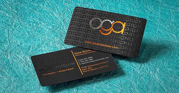
Your business card is the perfect canvas on which to build your brand. Include the logo, tagline, and color scheme you may be using in other marketing materials to make your business card part of a coherent experience.
Related: 3 Things a Lawyer Can Do to Grow Their Referral Network
6. Use Colors
Don’t feel like you are limited to staid blacks, greys, browns, or greens. Bold colors which complement one another are eye-catching and could make your card more memorable than a competitor’s.
7. Use a Hard Case
A hard case can prevent your cards cards from being damaged in your pocket. It also presents a much more impressive way to give your cards to potential leads.
8. Avoid Superlatives
Saying you are the “best” or “top” lawyer in an area could open you up to ethics violations. Avoid making such claims unless you have been recognized a susch by an organization.

9. Use Both Sides
Your business card has a small amount of highly valuable real estate. Use both sides to maximize the value of it to you and to its recipient.
Related: 14 Creative Ways to Use the Back of a Business Card
10. Don’t Misrepresent Yourself
If you work alone, don’t make it seem like you are part of a larger organization. Likewise, don’t imply you have employees working for you if you don’t own your own practice and have attorneys working under you.
11. Include a Call to Action
A business card is much more effective when it teaches the recipient something about the company it’s for. A call to action could distinguish your card from competitors and just might give a potential a lead a reason to call you back.
12. Clearly List your Location
If you don’t have a physical office, be sure to note this on your card. Failure to do so could set false expectations and could even count as an ethics violation.
13. Experiment with Cardstock Textures
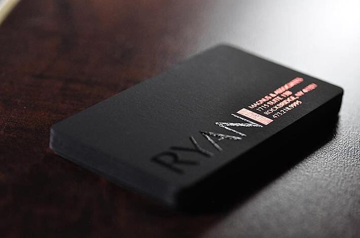
The feel of your business card could make it more likely that whoever receives it keeps it around as a decoration or novelty. Consider using a textured card stock such as suede or invest in premium printing methods such as Spot UV or die-cutting.
Related: What Is the Best Card Stock for Business Cards?
14. Choose the Right Graphics
Stock graphics could indicate a lack of imagination or effort and might turn off potential clients from your services. There are a ton of attorneys who use the gavel or scales of justice to represent their business. Use custom designs where possible and consider abstract options instead of typical law motifs.
15. Make Your Typeface Readable
The typeface you choose from most of your other, larger advertisements might not translate well to a small business card. Experiment with a few different typefaces to find the one that is best suited to your cards.
16. Laminate It
Laminating your business card can make it more durable, meaning a recipient might hold onto it longer. Other coatings can bring out more vibrant colors or could allow you to create a single-color card.
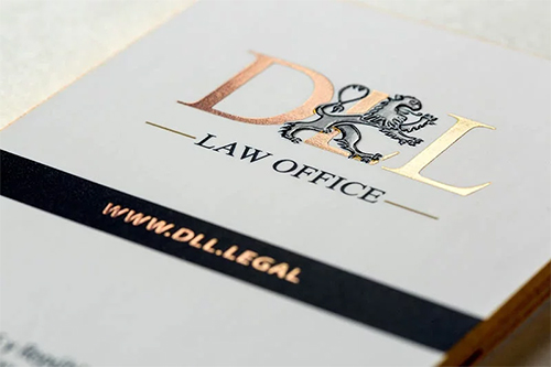
17. Foil Accents
Foil accents offer a simple and effective way to communicate elegance and exclusivity with your card. This can be especially helpful if you are pursuing a higher profile clientele or if you are trying to emphasize the exclusivity of your business.

18. Choose Matte
Matte finishes can make your cards look much more professional than ones that are glossy. While glossy cards can work when done correctly, a matte finish is easier to work with and adds an element of refinement from the start.
19. Make Your Card Memorable
Choose a design that can stick out from the cards of other competing attorneys. A staid, uninteresting card will be less likely to be remembered than one that has a daring, well-executed design.
Related: 8 Attractive Business Cards from Lawyers (And More)
20. Choose a Clean Layout
A busy, cluttered card can distract the reader from the important information, such as your name and contact information. Choose an uncluttered layout with only the information that is necessary for a potential client to know.
21. Miniaturize Your Logo
Your full-size logo might not translate well when placed on your business card. Experiment with a variety of stylizations to find the one that captures its essence while still being pleasing to the eye at a smaller size.
22. Include a Portrait
With dozens of practices likely operating in your market, it can help to put a face to the name of your company. Include your portrait on your card to make your brand instantly recognizable and to establish a human connection with new contacts from the start.
23. Use Tech
You may want to include a chip or a QR code with further information about your business, especially if you are trying to land tech-focused clients.
24. Change your Email
Your email address should have a generic extension such as Gmail or Yahoo. Using your custom domain URL conveys a much higher sense of professionalism.
25. Less is More
Your business card has a limited amount of space on which to share key information about your company. Only include the information relevant to attracting and obtaining new clients.
26. Avoid Minimalism
When executed poorly, a barebones design might actually make it less likely that clients remember you or call on you as it may indicate a lack of effort. When done well, though, minimalism may enhance your brand.
First impressions are everything, and your business card is usually the way you will make it with new contacts and prospective leads. Making your business card appealing to your clients can make it more likely yours is the one they remember from the hundreds they receive.


