Brochures will often provide a first impression for your business, event, or campaign. If the brochure isn’t both beautiful and professional you may not have the chance to make a second impression. There are several crucial aspects of putting together a fantastic brochure. The following are 7 custom brochure printing secrets of zinger campaigns.
1. Appropriate Format
A bi-fold, a tri-fold, or a variety of other formats are all options when putting together a brochure. If you just want to quickly inform your customers of a particular event or campaign, a single page flyer may be appropriate. If you have more than one product or service to promote a tri-fold or even a booklet style brochure is likely the best choice. Choosing the appropriate format also includes using the right type of paper.
2. Compelling Cover
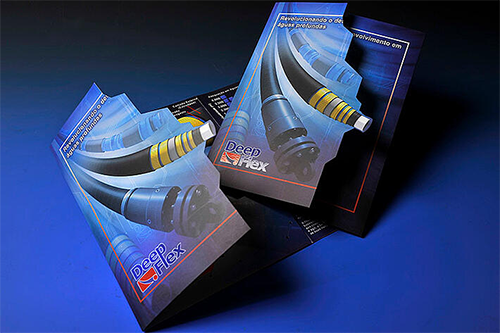
The cover is the first part of your brochure anyone will see and it needs to be inviting enough to cause them to want to see more. Beautiful photos or eye-catching graphics are almost always necessary to grab your customer’s attention. Pictures are able to quickly convey a message that could otherwise take an entire paragraph to say. Brochures with elements such as perforations or embossments have the ability to immediately stand out.
3. Complete Information
All applicable information such as the brick and mortar address, email address, and telephone number must be included in the brochure. It may also be necessary to include the names and brief biographies of key people in your business or campaign. This is especially crucial if you are providing a service where expertise is important.
Related: 10 Essential Components of an Effective Marketing Kit
4. Great Content
Whether it’s customer reviews or descriptions of a particular product, there must be compelling content to keep a customer reading. Use headlines that promote benefits and bullet points that point out key aspects of your service or product. More important than telling a customer about particular products or services is telling the customer what these products or services can do for them.
5. White Space
For the sake of readability, as well as appropriate presentation of graphics, it’s important to include an adequate amount of white space. Someone who doesn’t understand the elements of design may be afraid of white space and find the brochure “too empty.” White space adds a touch of elegance and helps the reader to more easily focus on the graphics as well as the text.
6. Custom Brochure Printing
The size, style, and color of your printing can make a world of difference in how the reader perceives your brand. Limit the number of fonts that are used in the brochure. In most cases it’s best to keep the printing as simple as possible. For example, using different fonts for each headline can be confusing and affect the readability of the brochure.
Related: 5 Awesome Marketing Tips for Small Business Owners
7. Call to Action
There must be a clear and specific call to action. Whether you’re selling products or providing a service it’s imperative you tell the customer why they should contact you and the best way to do that. It is important that the call to action stand out. This could be accomplished by using larger print or another color for this specific paragraph or sentence.
Ready to Go?
4ColorPrint can help you with all of your print-related needs. Come to us for your promotional and marketing materials, and we’ll help you develop a brochure that will knock your audience’s socks off.


