The visual impact of a business card may be more important than you think. You’ve probably been handed many business cards in your encounters with friends, colleagues, and business acquaintances. Do you throw them out, toss them in a drawer, or leave them out where you can remember to research or contact the business? That may depend on several factors, but one major one is the appearance of the card.
- Is it attractive?
- Does it convey a sense of professionalism?
Gone are the days of tacky business card background templates. You know the ones—a fancy wave shape with a gradient just so that you can convey your company information with just a pop of color.
But when it comes to promoting your own business, what kind of business card will stand out to your potential customers? By adding your phone number and logo, you have only begun to design a card that will have optimal impact. How do you jazz up the design without resorting to cliche business card backgrounds?
Related: Brand Collateral Design Tips that Effectively Promote Your Business
The ABCs of Business Card Background Design
So many factors go into designing an appealing card—color, texture, paper quality and thickness, glossy versus muted, plain versus a background design, and so on. Here are some considerations when planning out your background:
Choosing the Right Paper
Paper quality is one of the first things people notice. If you decide to go with a really simple business card background such as a single color, the paper texture is going to be your star player. Consider something that has texture or weight to it. Flimsy, poor quality paper gives the impression of a too casual, uncaring attitude rather than a serious business.
- Do you want a slick, glossy look or a muted but textured feel to the card?
- Do you want your card to be thick and substantial, or would recycled materials send the right message?
How Much Is Too Much When It Comes to Color?
The best thing to keep in mind here is to keep in line with the theme of your company. Some businesses go for a dark or black background to convey a sophisticated touch.
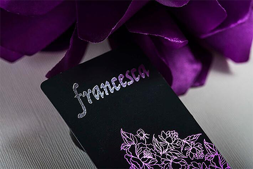
Elegant Black Background Using Our Onyx Suede Stock
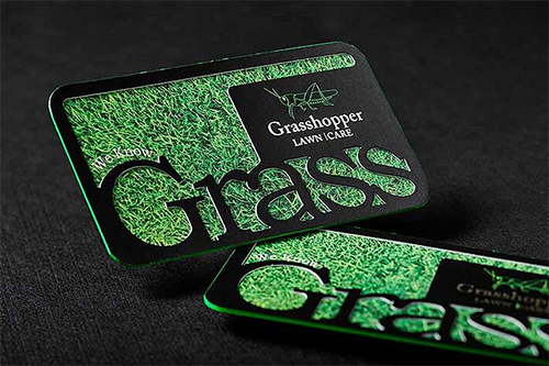
Others, such as for a day care facility or a florist, may opt for something more playful or serene such as pink or aqua. White may be a traditional background, but green or blue might better complement your business if, for instance, you are a landscaper or pool maintenance specialist.
Related: Your Guide to Color Theory for Design [Infographic]
How to Pull Off a Minimalist Design With a Plain Background
Sometimes less is more. A very simple design, if done professionally, can produce a stark image that gets attention. If a card looks too cluttered, the viewer may not want to be bothered to look for the pertinent information. Any serious business will want to get straight to the point, and your card can communicate that.
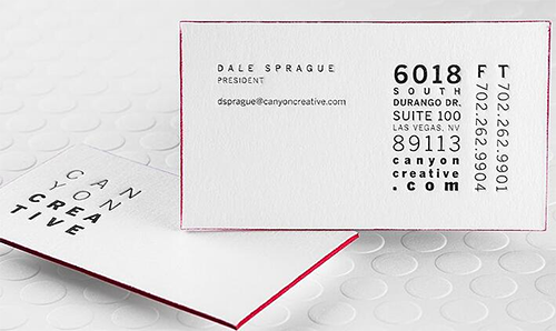
Minimalist Design with Letterpress and Colored Edges
Related: The 3 Top Logo Design Tips for a Minimalist Aesthetic
A plain design on an empty background can be attractive enough that the potential customer will leave it visible just for the simple and honest message or to enjoy your card as a tiny work of art. In order to avoid making it look too plain, however, use premium stock and other unique printing methods to enhance the design. This includes:
- Foiling
- Die-cut
- Colored edging
- Spot UV
- Embossing
Related: Are Unique Tactile Business Cards the New Norm?
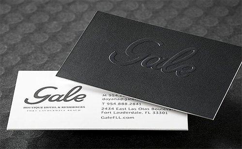
Great Minimalist Design With a Plain Background
Business Card Background Inspiration
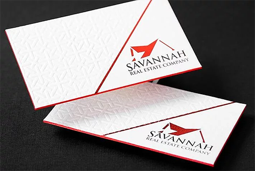
Cotton Business Card with Foil, Debossing, and Colored Edges
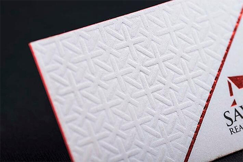
Close-Up of Debossing on Cotton
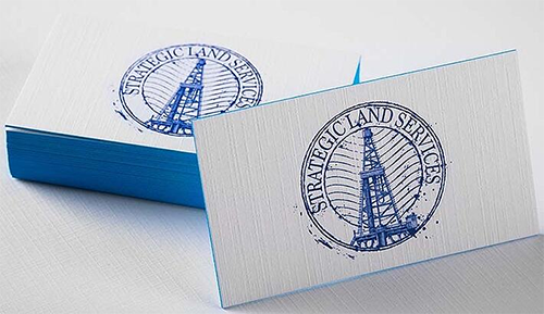
Textured Linen Business Cards With Colored Edges
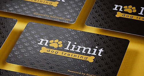
Spot UV Textured Background
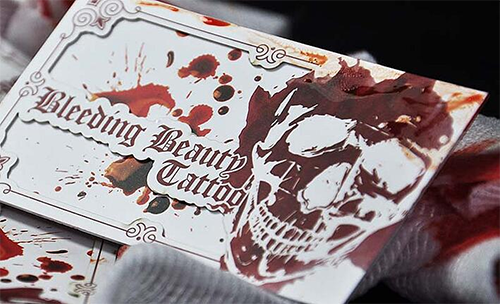
Gorgeous Detail in Die-Cut Card
Beautiful Business Cards With Custom Design
Designing a business card, if you are serious about your business, can require an artistic eye and the experience of a professional who knows what works and what doesn’t. At SILKCARDS, we work with our customers to custom design each business card to get the attention of customers and clients.

