A good photograph can stop someone in their tracks and really make them think. A good photographer, however, must stop someone in their tracks and convince them that they can take such pictures. Then, that customer must retain that first impression well enough to call them when they need a shoot. Drumming up business is sometimes frustrating, but the conversation can start with a great photographer business card.
Photographer Business Cards That Are So Photogenic They Should Be Models
Below are some awesome photography business cards for inspiration.
Related: 6 Business Card Printing Methods to Inspire Your Branding Strategy
1. Emily Meehan
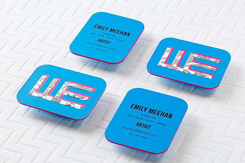
This artist works in flourescents, both in photography and traditional art, and that style is underscored in this fantastic card through the use of the saturated blue, hot pink colored edges, and fractured foil accent. This truly is a great example of consistent branding—they totally nailed it!
2. Aubrey Hord

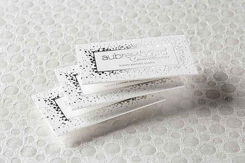
Aubrey Hord is a luxury portrait studio with a lot of their work focusing on wedding and special occasion shoots. You can totally see the elegance of the brand on this business card; silver foil printing, the swoop in the logo, and the choice of circles in an effervescent sparkly design. In addition, the letterpress effect brings a tactile experience to this card that further enhances its look.
Related: Are Unique Tactile Business Cars the New Norm?
3. Michael LaFrance
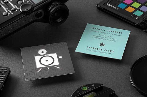
Oh, look! Another square business card. This professional works primarily in videography, so the shape of this card gives the feeling of a television, especially when paired with the boxy logo. The clean design and different color choices for each side really work well for this card.
4. Lentille Photography – Allison Craig
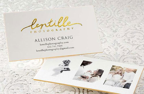
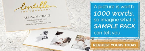
What’s not to like about this one? An exquisite gold foil for the logo, elegant serifs to convey a sophisticated message, and gold colored edges to give the minimal white design a dash of exciting. They also chose to include 3 images on the card as a mini portfolio of their own work, providing a sense of credibility to anyone who receives it. Exceptional strategy!
Related: When Is It Acceptable to use a Script Font in a Design?
5. Photo Booth Studios
Just the logo and one-line description on the main side—too plain of a design choice? Absolutely not. The holographic effect from the gold foil really enhances the logo and provides a stark contrast to both the white background and the black tagline below. The embossing of the logo on the business card also provides a visually interesting effect. The contact info is saved for the back side as to not distract from the beauty of this design.
6. Guillermo Piloto
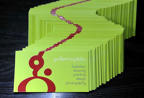
Being a photographer and illustrator of children’s books in particular, one has to have a bold and eye-catching business card. This one just stuns with the almost acidic green and the spot UV logo.
Regardless of your style, brand, aesthetic, or preference, SILKCARDS can build you a business card that just feels like YOU and tells your clients who you are as an artist and a photographer. To show you exactly what we’re capable of, we’re offering FREE sample packs. Request one below.

