If you are new to editing or creating graphic designs, you do have the potential to accomplish a rebranding, design a new logo, or develop graphics for a new marketing campaign. You can still have a mind-blowing aesthetic design without the cost of hiring a designer.
Techniques for Non-Designers to Great Images and Designs
Any solopreneur or small business owner on a budget can learn simple graphic design techniques with dedication and patience.
1. Don’t Overdo It
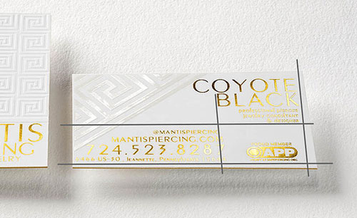
There is a misconception that in graphic design more is better: more colors, texture, and bold fonts. Do your best to avoid distracting the eye by using a grid layout to verify the best place to put images, objects, and your logo.
Related: The Top 3 Logo Design Tips for a Minimalist Aesthetic
2. Pair a Black and White Image With 1 Brand Color
Black and white go with everything, and the contrast it creates will make a brand color pop.
3. Use Lots of White Space
The fewer images, designs, and colors in graphic design with the use of white space the better. White space refers to the space left between text, columns, graphics, images, and margins. White space allows readers to fully take in your message without distractions caused by cluttered elements.
4. Keep Your Fonts Simple
Elaborate fonts can distract from your messaging or make the design difficult to read. Plus, you’ll want to stay consistent with your brand as much as possible. Use a maximum of two different fonts. Decorative fonts, such as scripts or designer fonts (perhaps used in your logo), should be reserved for large text only while body text should be simple and clean.
Related: When Is It Acceptable to Use a Script Font in a Design?
5. Choose Color Wisely
We highly recommend you choose two colors that represent the true essence of your business. One color can be used for the designs main elements, and the second can be used to draw emphasis. The best way to accomplish this is to contrasting colors or a different tint of the same color.

6. Implement Good Alignment
Poor alignment can make beautiful design elements look horrible. It’s important to arrange items in a way that matches how people normally scan for information, so having unbalanced and helter skelter information and imagery can cause confusion. Be mindful of edges and centering.
7. Be Creative
You don’t have to copy your competitors to create compelling designs. Avoid using standard icons and symbols you regularly see used in your industry. If you take the time to research and sketch ideas for original images; yours will connect on a deeper level with your customers than any regurgitated symbolism.
Related: Brand Reinvention Tips from Your Competition
8. Have Fun with Filters and Cropping
The new age of digital design will never go old. You can create a focus on the center of images by cropping images. The focal point can be discovered by taking a few steps from your computer. The corners of the image might be the reason your current designs appear busy to the human eye.
The use of filters can help blend in multiple colors and create new textures. Even simple color correction or going grayscale altogether can help a single image flow more cohesively with your design and brand colors.

9. Pair Color Blocks With Images
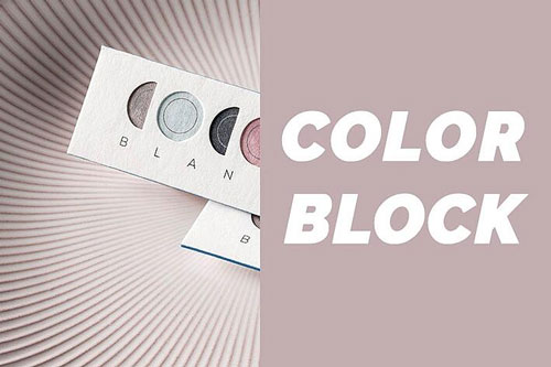
Have a lot of great photography? The primary color you use for branding can be used as a color block to the right, left, top or bottom with a powerful image.
10. Don’t Wash Out Your Text
When you use text, try not to conceal it with an image that is bright or has multiple colors. Decide if it’s the image you want people to focus on or the text and emphasize one over the other. This can be done with having more striking colors on one over the other, using heavy or bold typography, or through the layout of your design. Bottom line is that your design elements should not need to compete.
11. Think with a Graphic Designer Mindset
You are a business owner, but think with a graphic designer’s mentality when working on advertisements, website graphics or marketing materials. If you take the time to Google graphic designs from the top companies, it will provide a starting point on quality for your upcoming project.
Related: Brand Collateral Design Tips That Effectively Promote Your Business
Now take your design to the next level by bringing it to life with high-quality printing methods.


