So we’re sure that you’ve seen business cards with foiled accents on them, but that’s not what this process is all about. Cold foiling is completely separate and has a distinctly different look. Unlike the “hot foil” (or regular foil) process, cold foil is capable of a variety of different colors and effects while the regular foiling process is limited to just certain foils. Check out some of the unique styles we’ve achieved for our clients with cold foil business cards below.
Textured Cold Foil Business Cards
The texture on these business cards are just too insane to be real:
1. David Fenton, Digital Artist
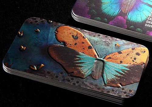
With a combination of cold foil that gives this metallic-looking surface and embossing for extra texture, this butterfly looks like something out of a dystopian dreamland. When it rotates in the light, there is a visible sheen.
2. Perfect Pool Service
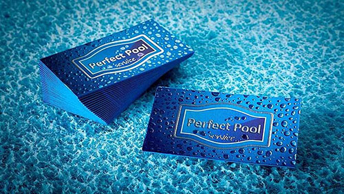
It’s hard to tell in the photo, but this business card uses cold foil for bubbles that look practically poppable. With a silver coloring, cold foil, embossing, and Spot UV, this is a perfect depiction of an underwater relaxation haven.
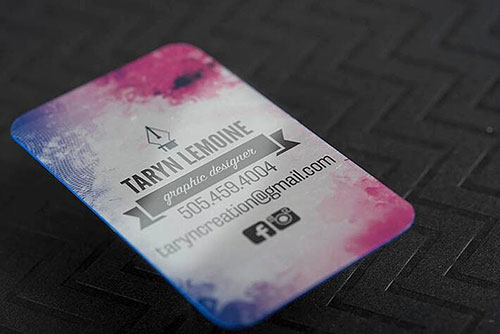
3. Taryn Lemoine, Graphic Designer

What’s not to love about this card? The cold foil adds a distinct gloss over bold and tastefully done flat design and feminine water color and grid textures. The rounded edges further the soft appearance, and that bright colored edge lulls us out of being sucked into the pink and purple colors.
Related: Flat Design vs Realism: Which Is Right for Your Brand Identity?
4. Alexa Grace, Creative Stylist
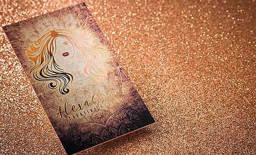
This card uses thick, bright colored edges along with a brown palette that is perfect for touches of foil. The woman’s face and hair is soft and not too overdone with foil, and the business name is elegantly scripted.
Related: When Is It Acceptable to Use a Script Font in a Design?
5. The Invitorium
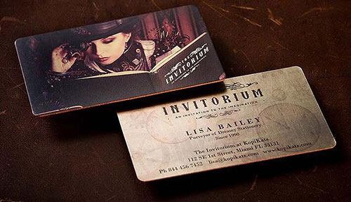
This card is all about the image, which implies a mysterious and almost sensual steampunk story. The tones are muted but rich, all except for the contrast of that colored edge. The sans serif fonts that are used further pushes the fantasy.
6. Mike Huges Knives
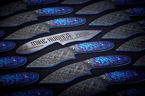
This card totally shatters the expectation of the typical rectangular business card. The business owner wants you to know exactly what his trade is, and he’s successful with the die-cut knife shape. The cold-foil adds a bit of metallic, bringing the shape to reality.
7. Paul Beltran Fashion Photography
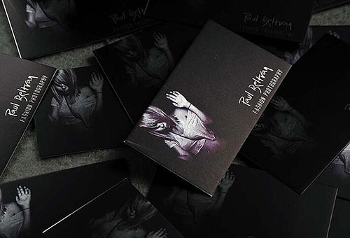
Just like with The Invitorium, this card is all about the image, which makes sense since it is a photographer’s card. The cold foil adds depth to the texture and appearance, though, which is an expert use of the feature.
Not interested in cold foil? See more of our features in action by ordering a FREE sample pack.

