The way you brand your business continues to be a huge part of your success. The right branding design can take your business from ho-hum to fantastically memorable. The type of brand that really works well is one that not only has people talking about it but also has people sharing their impressions about it. Here are some ideas on making your own branding design that suits your business.
What’s Current
Branding is nothing new, but you can still stay on the cutting edge of the strategies and innovations that are working best for today’s audiences.
Brand Transferability.
Choose a branding design that is easily transferable to numerous properties. Your brand should be one that looks as great on your social media accounts’ home pages as it does on your business cards. Similarly, if you can capture the best attributes of your brand and integrate them into your marketing materials for trade shows, packaging and other popular uses, your business will enjoy a boost in its visibility.
Related: Keeping Your Brand Consistent. Matching Online and Offline Identity.
What Works
The tried and true methods can always lend a hand when you’re continuing to market yourself.
Going Bold.
Instantly brings to mind bright pops of color in the form of your brand. This is not the only way you can go bold though. Choosing a brand that features contrasting colors, for example, makes a bold impression that people are likely to remember. Going with an angular look in the way the letters of your brand fit together or by choosing a geometric shape to enclose it rather than a circle are other ways to go bold that can result in memorable branding.
Texture.
Texture is another word—like bold—that is often misunderstood to have only limited uses and meanings. In actuality, understanding the intricacies involved in texture allows you to expand your brand into one that is elevated above others. Many people think of texture as being a large and distinct change in between two materials.
Related: Are Unique Tactile Business Cards the New Norm?
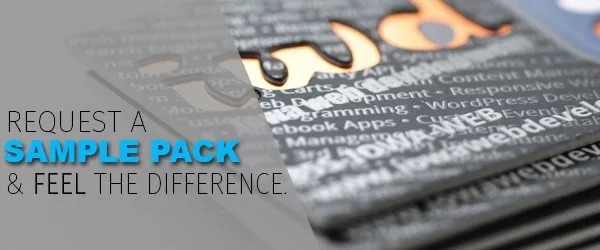
Expanding your understanding of the word texture means including the unexpected in your brand. Rather than smooth, for example, add a fine linen feel to your brand’s materials and watch the comments begin to fly. Just be sure to stick with one or two textures at the most. Using too many makes it easier for the message of your brand to get lost in the novelty of it all.
What Doesn’t Work
Sadly, a lot of people go about doing their business cards in a way that’s simply not effective. Beware of the following huge error that seems to be common among the worst business cards.
Over-the-Top Design.
People are going for minimal frills, so fluff is out these days. Make sure your brand speaks to their natural inclination to consolidate and keep thing organized.
Flat designs that get your message across with a bold—or subtle, depending on your business—way can make you stand out from the crowd in your industry. Making your brand one that makes the cut in the minimalist view of your target audience is possible by making your branding design speak their language.
Related: No-Nonsense Business Card Design Tips You Can Use Today
Looking for marketing materials, business cards and more that captures the true essence of your business? DGi provides excellent creative branding design services that take your business effortless to the next level of visibility. They work closely with you to design a branding image that reflects your goals and culture.


