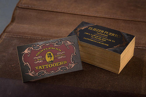
Designing a professional business card with a truly memorable look is far from being a 2-step process that you could complete at the speed of light. On the contrary, the design phase requires quite a bit of time, attention and the highest dosage of creativity if you want to truly wow your clients and business contacts.
While every card should be unique and recognizable, here are 10 basic business card design tips that you can apply to get a few steps closer to perfect results.
1. Plan Everything in Advance
Taking your time to nail down your approach makes will make it possible for you to gather some of the best design ideas, mix and match different graphical elements and preview your favorite designs without the pressure put on your shoulders by an approaching deadline.
2. Choose the Most Relevant Contact Information
Overstuffing your layout with unorganized contact information is not the best tactic. Ideally, you should display only the contact information that your connections are more likely to use to reach you such as phone number, physical address, email, links to a website or social media profiles, or QR codes.
3. Come Up with the Most Original and Compelling Support Text
While contact information is a vital component of your business card design, it may not be enough to convince recipients to follow up with you on its own. Your info should be accompanied by support text in the form of a call-to-action or a tagline to encourage your potential clients to get in touch with you.
4. Add Visual Cues
Photos or illustrations can be compelling when you want to send a visual message of what you, your company and your product or service is all about. When adding visual cues to your template of choice, remember that less is more—avoid crowding the space as that can detract from the design.
5. Opt for the Most Remarkable Color Scheme
Choose a color combo that helps reflect your industry, niche, products, personality and personal style and taste. If you have a specific brand identity that can be represented with a certain color, make sure your cards are cohesive with that. Avoid contrasts and hues that may turn the card into a real eyesore and lower the readability of your support text and contact information. The clearer, the better.
6. Choose the Best Material
Many people use plain cardstock when it comes to choosing materials for their cards, but did you know that you could explore other unconventional mediums to make a powerful statement? These days, many companies go for more texturized and tactile materials such as metal and silk to make their designs memorable.
7. Identify the Best Size and Shape for Your Cards
3.5 × 2-inch horizontal rectangle is the standard format of business cards in the U.S. While most still choose to hold on to this format, you could unleash your creativity and go with unique shapes and sizes, including animal and object-shaped designs, to convey a stronger, personalized message to your audience and make it easier for your clients to remember you.
8. Select the Best Imprint Method
Note that you could individualize your designs even further by going for a specific imprint method matching your practical and aesthetic demands. Foil-stamped or foil-embossed business cards are both possible in this area.
9. Explore Different Coating Options
You could also boost the appeal and durability of your cards by relying on a nice finish. Now you can select the best coating from a plethora of options, including lamination—which offers excellent protection against spills, tears and other damages—UV coating for enhanced appeal, spot coating and aqueous methods.
10. Keep It Simple
Last but not least, remember that less is often more when designing unforgettable business cards. After all, you could never go wrong with a classy business card with a minimalist design.
If you’re still looking for ways to personalize your business card design in a tasteful manner, get the best tips and expert support from 4colorprint.com.


