
Written by Henry Fan · Founder, SilkCards
25 years turning ink, foil, and pressure into first impressions that don’t get forgotten.
The Counter After the Walk-Through
Picture the moment with a luxury real estate business card in play. The walk-through ended ten minutes ago. The handshake was warm. You answered every question well. You left the sellers with your card on the kitchen counter and walked out to your car feeling good about the appointment.
Two hours later, the sellers are sitting at that counter with a glass of wine. Three other agents came through this week. Three other cards are on the counter with yours.
Which card is still face-up? Which one already moved into the kitchen drawer?
That is the question this article answers. Not how to design a real estate business card. Not what information to put on it. The deeper question — the one that decides which agent the sellers call in the morning. Luxury real estate business cards are not made luxurious by their design. They are made luxurious by what the seller’s hand and eye decide about the card before the design is read.
SilkCards has been building the cards that luxury real estate professionals hand over at $1M-plus listing appointments since 1997. What follows is the manufacturing truth that most agents have never been told — because the printers who would have to admit it cannot make the card the truth describes.
Where the Card Actually Lives After the Handover
Most business card articles treat the handover as the final scene. It is not. The handover is the start of the card’s real life — and for a luxury real estate professional, that life happens in three rooms.
The listing-appointment counter. Where competing agents’ cards land side by side. The sellers are not comparing fonts. They are reaching for the cards over the next forty-eight hours, picking them up, putting them down. The card that stays face-up — flat, unbent, intact — is the card the sellers reach for first.
The client wallet or coat pocket. After a buyer’s tour. After a listing presentation that ended in the entryway. The card is folded against keys, against other cards, against the friction of a full pocket for the next ten days. A card that creases or scuffs becomes the card the client throws away on Sunday.
The client folder, for the next five years. Past clients refer. Their friends ask who they used. The card pulled out of that folder is the first impression your next referral will ever have of you. The card has to look like the agent on the day it was handed over — not a faded version of that agent.
A luxury real estate business card is a working object. It has to survive contact. And the specification that decides whether it survives — quietly, before any design conversation begins — is what the card is made of.
The Half-Second That Decides the Ranking
There is a half-second between the moment a recipient’s fingertips touch a business card and the moment their eye reads the name. That half-second is not empty time. It is the time the seller’s hand uses to decide what kind of professional they are about to look at.
A standard real estate card lands in the hand and registers as exactly what most cards have always registered as: a thin object with a name on it. The recipient’s brain logs the weight, releases the inquiry, and moves on. Nothing has happened yet.
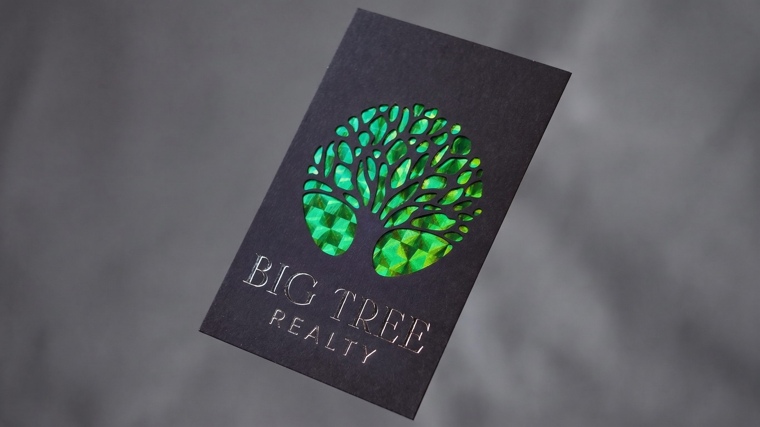
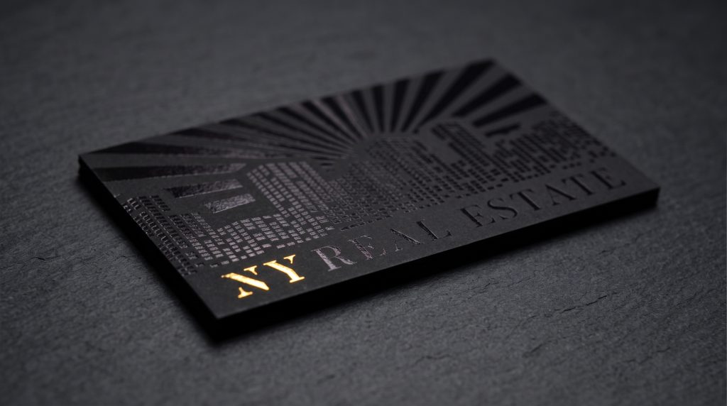
A 32pt dressed-layer card lands differently. The weight is double. The surface is soft. The edge is heavier. The thumb finds the foil before the eye locates it. In that half-second, before a single word on the card has been read, the seller has already started reorganizing their mental ranking of the agents at the table.
This is not aesthetics. It is physics. The hand processes weight, friction, temperature, and surface texture milliseconds faster than the eye processes the design. The card that arrives heavier and finer than the room expected has already moved into a different category before the name registers.
This is what your card is competing for at a luxury listing appointment. Not the seller’s eye. The seller’s hand.
The Spec Question Most Luxury Real Estate Business Cards Avoid
Here is the question almost no real estate card listing answers directly: how thick is the card, and what is the card made of all the way through?
Most cards marketed as “premium” or “luxury” for real estate top out at 16pt — the same weight as the cover of a paperback book. The marketing language stretches: ultra-thick, luxe, triple-layer, premium-plus. The card is still 16pt when it lands in the hand.
The cards that do go thicker — 32pt, 48pt — almost always make a quiet trade most buyers never learn about. To reach the thicker weight, the printer abandons the laminated finish. The 32pt card is no longer suede or silk or linen all the way through. It is pre-manufactured mill paper — a finished thick sheet bought from a paper mill, with ink printed on it. The thickness is given. The surface above 16pt is the trade.
The recipient cannot see the trade. They can feel it. The thick card lands heavy but the surface is plain. The fingertip finds bare paper. The contradiction registers somewhere below conscious thought: this card is trying to feel premium and not quite making it. The seller’s hand has a vocabulary for that contradiction even when the seller’s mouth does not.
SilkCards refused the trade. Our 32pt construction is two individually finished 16pt sheets bonded together — each sheet dressed in suede, silk, or linen before bonding. A 48pt card is three. The customer never touches bare paper anywhere in the build. The thickness is the same. The surface above 16pt is not the trade. It is the standard.
The card is luxurious or it is not. The design is a passenger.
Five Surfaces, Not Two
A standard business card has two faces. Most printers treat it that way and stop. In twenty-five years at the production floor, I have watched competitors argue over the front and the back of a card and quietly leave the rest of the card undesigned.
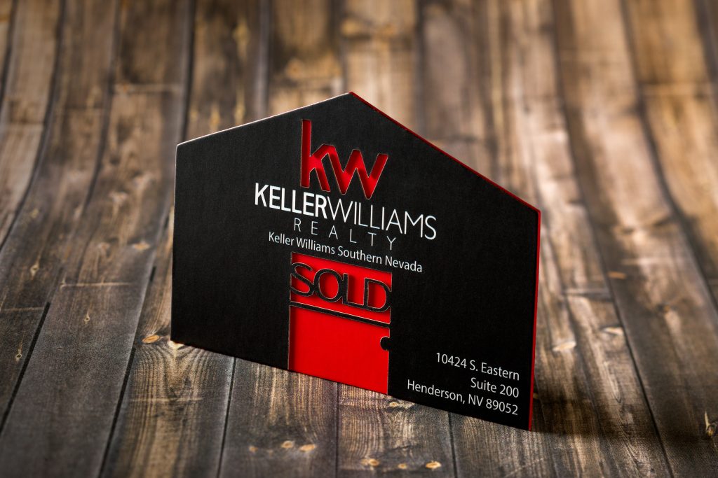
A SilkCards card has five designed surfaces — front, back, and three edges.
The edge is the first surface the recipient’s fingers touch during the handover. It is touched before the face is read, before the design is processed, before the eye locates the name. For a luxury real estate card, that means the edge does work the design will never get to do — because the edge does its work first.
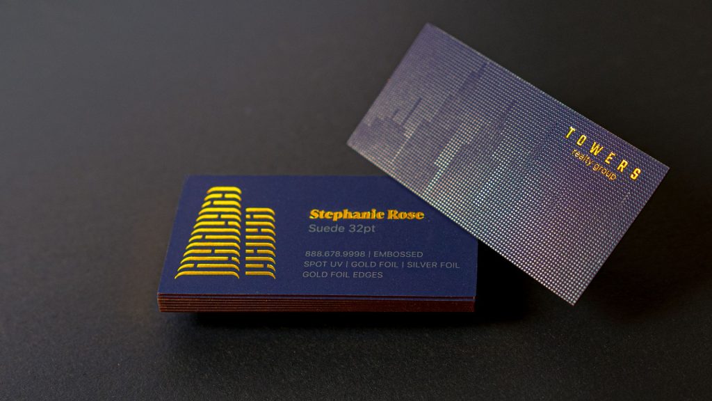
A painted edge in a single deep color — black against a white card face, navy against ivory, cream against onyx — registers as a deliberate choice the moment the recipient’s thumb finds it. A foil edge — gold, silver, pearlescent, holographic — does something stronger. The card stacked among three other cards on a kitchen counter is visible from the side as a thin line of color or shimmer that none of the other cards have. The seller does not need to flip the cards over to find yours. The edge has already told them which card is yours.
At SilkCards, the edge program runs to sixty options — twenty-four painted ink colors and thirty-six foil edge finishes. To my knowledge there is no other online business card printer with this depth in the edge category. Most provide a basic edge service on some products. Most have not yet recognized the edge as a surface that gets to do work.
The edge is the surface that gets to do work first.
When Gold and Silver Stop Being Enough
Foil is the most-asked-about finish in the luxury card category — and the least understood. Most premium business cards programs run two foil options. Gold and silver. A small handful run four — gold, silver, copper, rose gold. The conversation ends there.
For most professional cards, two foil options is enough. The agent’s name in gold on a navy field is a respectable card. But for a luxury real estate professional whose brand identity has specific color discipline — a brokerage with a defined champagne, a personal brand built on slate gray and warm white, a luxury team using oxblood and bronze — two foil colors stops being a finish system. It becomes a forced choice.
SilkCards runs thirty-eight foil colors across five named families. Past the gold-and-silver default, foil stops being an accent on a card. It starts being an illustration medium. A logo rendered in four foil tones that shift across the surface. A monogram set in a brand-specific bronze that does not exist in any other catalog. A photographic-style detail rendered in foil that catches light the way the design intended it to.
A luxury real estate professional whose brand is the reason a seller chose to interview them does not need a card with their name in gold. They need a card with their brand on it — in the foil their brand actually uses.
This is not a finish. It is vocabulary. Most printers have a foil vocabulary of two words. Past four, the conversation changes.
The Digital Card Question
This article would be incomplete without addressing it directly: should a luxury real estate professional hand out a physical card at all, when digital business cards and NFC-tap profiles can deliver a contact, a listing, a virtual tour, and a CRM hook in a single phone tap?
The answer is not either. The answer is both — and in a specific order.
The digital card is the right tool for the rapid-network handoff. A buyer’s agent at a brokerage event taps phones with another buyer’s agent. The contact saves itself. The CRM does its job. The relationship has begun before the second cocktail. No physical card is required for that moment, and a printed card in that context is mostly ceremonial.
The physical card is the right tool for the high-stakes first-meeting handoff. The listing appointment. The referral handover from a past client to a new client at a kitchen table. The end of a presentation where the seller is going to interview two more agents before deciding. In those moments the digital card cannot do the work the physical card does. There is no half-second of weight, no edge against the thumb, no foil catching the warm light of a high-end home, no card sitting on a counter for forty-eight hours doing passive marketing while the seller decides.
The luxury listing-appointment moment is a physical-card moment. The buyer-network event is a digital-card moment. A serious luxury real estate professional carries both — and chooses correctly in each room.
The card that is worth carrying in the physical-card moment is the card this article describes.
Hold one before you order one.
A 32pt dressed-layer SilkCards card with foil and a painted edge lands in the hand differently than any description of it can. The free sample pack ships in three business days.
The Math of a Luxury Listing
A luxury real estate professional working at the top of the market closes one $3 million listing and earns a commission that, depending on side and split, lands somewhere between $45,000 and $90,000. One closed listing.
A run of 500 luxury business cards built to the spec this article describes — 32pt dressed-layer construction, foil, painted or foil edge, full design freedom — costs less than the gas a luxury agent puts in their car in a busy quarter.
Why the Investment Math Works
The math does not move. Five hundred cards cost a fraction of a fraction of a single commission. The cards are not a marketing expense. They are capital allocation against the one variable that decides which agent the seller calls in the morning — the first physical artifact the seller holds while ranking the agents at the table.
The wrong card costs the listing. The right card costs the price of a long lunch.
This is the question every luxury real estate professional should ask before reordering the same cards they have been ordering for years. Not “what does the card cost.” What does the wrong card cost.
What Luxury Real Estate Business Cards Mean for the Next Listing You Want
If you are competing for $1M-plus listings, your card is not finished when the design is approved. It is finished when the card you can hand to a seller is at least as well-built as the home you are about to list.
The seller is going to be evaluated on craft. So is the agent.
The Construction That Decides
The specification that decides whether your card meets that bar is the construction underneath the design. 32pt or thicker. Dressed-layer all the way through — every interior layer suede, silk, or linen before bonding. Foil chosen from the actual brand palette, not the default two-color menu. An edge that is a fifth designed surface, not a leftover.
That card costs a few minutes more to specify and ships in the same timeline as a less-considered card. It lands in the seller’s hand at the moment the seller is deciding whether you are the agent who will represent their $3 million home.
In that half-second, the card is no longer a marketing material. It is the first piece of work the seller has seen you do.
Make it work that is good enough to win the listing.
See the spec in your hand before you spec it for your brand.
The SilkCards free sample pack includes 32pt dressed-layer construction, multiple foil finishes, and a painted edge — so you feel the difference before you order.
Frequently Asked Questions
Common Questions on Specification
A luxury real estate business card is defined by its manufacturing, not its design. The card has to land heavier than the cards the recipient is used to, feel finished — not bare — all the way through, and survive the listing-appointment counter without bending or scuffing. Specifically: 32pt or thicker construction, with every interior layer dressed in suede, silk, or linen before bonding. Foil chosen from a broad color system, not a default two-color menu. An edge that is a designed surface, not a leftover. Design refinement matters, but the design is a passenger. The card is luxurious before the design is read, or it is not.
32pt is the floor where a real estate business card starts to behave like a luxury card in the hand. Most cards marketed as “premium” or “luxury” by real estate marketing companies top out at 16pt — the weight of a paperback book cover. 48pt construction is also available for top-of-market positioning. The number to ask about is not just the thickness — it is whether the interior layers are finished or bare. A 32pt card built from finished layers feels different from a 32pt card cut from a single pre-bonded mill sheet. Both are 32pt. Only one is luxurious.
Both — in different contexts. The physical card wins at the listing appointment, the referral handover, and any high-stakes first-meeting where the recipient will hold the card and rank the agents who came through this week. The digital card wins at rapid-network events where contact handoff speed matters more than impression. A serious luxury real estate professional carries both and chooses correctly for each room.
More About Luxury Card Specs and Finishes
Full legal name, direct phone number, professional email, brokerage name and logo, and your real estate license number — which is required on marketing materials in most U.S. states. Headshots are optional and remain a personal-brand decision. A one-line market specialty — “Westside · Architectural Homes,” “Lakefront Estates · North Shore” — is often used by luxury agents to anchor recall, but not required. Verify your state’s specific advertising requirements before printing.
Suede lamination is the most common starting point for luxury real estate cards because the soft surface produces the strongest first-touch reaction and creates maximum contrast with foil. Silk lamination is the alternative for agents who want a more polished surface and may write on their cards. Linen is preferred for agents whose brand reads as established or traditional — old-money aesthetics. The right finish depends on the agent’s brand. The wrong finish is no laminated finish at all on a card that calls itself luxurious.
Different tools. A metal card produces an immediate and unmistakable weight reaction. It is the right answer when the agent’s positioning depends on a single dramatic signal in the first second. A premium paper card built from dressed layers — with foil, edge treatment, and a refined finish — produces a more nuanced and durable impression and offers far more design and brand-color flexibility. Premium paper is also the format that survives the kitchen counter, the wallet, and the client folder better than metal cards in many real-world handover contexts. The right answer depends on the agent. Both belong in the luxury category. The cheap printed card does not.
More Questions About Luxury Real Estate Business Cards
About the Author
Henry Fan founded SilkCards in 1997 in Chicago. Twenty-five years on the production floor — ink, foil, pressure, and the cards luxury professionals hand over at the moments that decide whether the next call comes. SilkCards holds an A+ BBB accreditation since 2005 and serves over 100,000 trade accounts globally.