
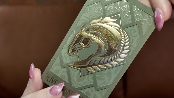
Premium business cards are not just nicer versions of standard cards. They are a different category of object. The properties separate them: heavier paper, surfaces that behave differently under the fingers, finished edges, deeper printing. You notice a premium business card before you read a single word on it.
Written by Henry Fan · Founder, SilkCards
28 years turning ink, foil, and pressure into first impressions that don’t get forgotten.
I have spent 28 years watching what happens in that moment of handoff. First as a graphic designer who could never get a printer to render a layered idea correctly. Then as the manufacturer who built the company that finally could. The patterns are remarkably consistent. The premium business cards that change rooms are not the cards with the most features. They are the cards where every physical detail does a specific job for the brand behind them.
What this guide covers
This guide covers everything that makes a business card premium — the physical properties that separate a card worth keeping from one that ends up in a drawer. We cover weight, texture, finish, edges, shape, material, and how to choose the right combination for your brand.
What Is a Premium Business Card?

A premium business card is a card that communicates quality before anyone reads it. The definition is physical, not visual. You can tell the difference in the dark.
Printers produce premium cards on heavier stock — typically 32pt to 48pt — compared to the 14pt stock that standard cards use. Coatings, textures, and surface treatments finish these cards — changing how they feel and how they reflect light. Many include edge treatments, specialty materials, or dimensional print effects like foil and raised spot UV.
The gap between a standard card and a premium card is not about design. It is about the physical object. A well-designed card on 14pt stock still feels thin and temporary. The same design on 48pt suede lamination feels like something a person keeps.
Why Premium Business Cards Still Matter
Every year someone announces that business cards are dead. Every year, the people who hand out premium cards report the same experience: the card gets kept, commented on, and remembered.
However, digital introductions are efficient. They are also forgettable. A name in a phone contacts list competes with hundreds of other names. A physical card sits on a desk. It sits in a wallet. It ends up pinned to a board. The physical object carries the brand forward in a way that a digital transfer does not.
Premium cards amplify this effect. When the card feels like it cost something to make, people treat it like it is worth something. That is not a marketing theory. It is how objects work.
What Makes a Business Card Feel Premium
Six physical properties determine whether a card reads as premium or standard. They work independently and in combination. Understanding each one helps you make decisions that are specific to your brand and your industry.
- Weight — the thickness and mass of the stock
- Texture — the surface feel of the lamination or coating
- Finish — how the surface interacts with light
- Edges — what happens at the perimeter of the card
- Shape and structure — standard rectangle versus custom cuts or folds
- Material — paper versus cotton, wood, metal, or other substrates
Furthermore, most premium cards combine two or more of these properties. A 48pt suede card with foil and painted edges hits weight, texture, finish, and edges simultaneously. Each layer adds to the perception of quality. The combination only works if it is intentional.
Weight: The Foundation of Premium Business Cards
Weight is the first property a hand registers when it picks up a card. It happens before any visual processing. A card that is heavier than expected signals investment, permanence, and confidence. A card that is lighter than expected signals budget, disposability, and low stakes.
Business card thickness is measured in points. One point equals 1/1000 of an inch. Standard business cards are printed on 14pt stock. Premium cards typically start at 32pt and go up to 48pt for ultra-thick options.
The Common Thickness Levels
14pt — Standard. What most print shops produce by default. Thin, flexible, and immediately identifiable as the baseline. Works for high-volume, low-cost runs but does not communicate premium.
16pt — Slightly above standard. The difference is perceptible but not dramatic. Still falls in the standard category for most hands.
32pt — Where premium begins. At 32pt, a card has genuine weight. It does not flex easily. When it lands on a table, it makes a sound. This is the entry point for most SilkCards products.
48pt — Ultra-thick. 48pt cards are more than three times the thickness of a standard card. The effect is unmistakable. You feel it before you see it. 48pt is the maximum production thickness available for most specialty materials.
Note: On 48pt and ultra-thick premium business cards, the edge becomes a deliberate design surface. The perimeter is large enough to carry color, foil, or layered detail — the edge reads as part of the card’s identity, not as a raw cut. As a result, edge treatments are visually powerful on heavier stocks.
Texture: How Premium Business Cards Feel in the Hand
Texture is what happens when someone runs a thumb across the surface of your card. It is a slower, more intimate register than weight — it requires deliberate touch rather than passive contact. When texture is distinctive, people notice it consciously. They often mention it.
In fact, most texture in premium cards comes from the lamination applied to the printed sheet. The lamination does two things: it protects the print, and it defines the surface feel.
Lamination Types and Their Feel
Gloss lamination — Smooth, reflective, high-contrast. The surface slides under the finger. Gloss maximizes color vibrancy and creates a polished, contemporary look. Common and widely understood as professional.
Silk lamination — Smooth but with a satin quality. Less reflective than gloss. The surface has a subtle warmth. Silk is the most neutral premium finish — it elevates without announcing itself.
Suede lamination — The most tactile of the standard laminates. The surface has a soft, almost velvety resistance under the finger. Suede is the finish that people describe as feeling expensive before they can explain why. The matte surface also makes colors appear deeper and more saturated.
Soft-touch — Similar to suede in feel but with a slightly different texture. Both are in the premium tactile category. Suede tends to have more grip; soft-touch more slip.
Finish: How Premium Business Cards Catch the Light
Finish refers to how the surface of the card interacts with light. Notably, this is distinct from texture (which is tactile) and from printing (which is two-dimensional). Finish describes the three-dimensional behavior of light across the card’s surface. Reflection, refraction, contrast, and shadow all play a role.
Foil
Foil stamping applies a metallic or pigmented film to selected areas of the card using heat and pressure. The result is a mirror-bright surface that reflects light differently from every angle. Foil is the most immediately recognizable premium finish — the visual impact is instant and unmistakable.
Flat foil covers a design element with a smooth metallic layer. Raised foil adds a dimensional element — the foil surface is embossed, creating a texture you can feel as well as see. Raised foil combines the visual impact of metallic reflection with the tactile interest of surface relief.
Spot UV
Spot UV applies a layer of clear UV coating to selected areas of the card. The contrast between the UV-coated area and the uncoated area creates a visual effect that shifts as the card moves in light — the coated area appears to glow or lift off the surface. Raised spot UV adds a tactile dimension on top of the visual one.
A note on combining finishes
Foil and spot UV can be applied to the same card. The combination creates layered visual depth. The foil reflects light from one plane. The spot UV reflects from a slightly different angle. When the card moves, the interaction between the two finishes animates the design. This is one of the most complex and visually compelling effects available in business card printing.
Edges: The Fifth Surface on Premium Business Cards
Most people design a business card thinking about what someone sees face-on. The edge is what they see in other moments — when the card is sitting in a stack, held between fingers, or fanned out across a table. The edge identifies the card in a pile.
Standard business cards have white or off-white edges — the raw paper substrate exposed at the cut. Premium cards treat the edge as a design element.
Edge finishes apply color to the cut edge of the card. For ultra-thick layered cards, the edge color can come from an exposed interior layer. A bright or contrasting interior color creates a visual stripe visible from the side. For standard-thickness cards, the printer applies edge color as a painted treatment after cutting.
Therefore, edge finishes are visible in two situations. The first is when the card is held in the hand — the viewer sees the edge as the thumb and finger hold the card. The second is when multiple cards are stacked — the edge creates a consistent horizontal color band through the stack. Both situations are brand moments most designers never plan for.
Shape and Structure — When the Card Becomes Part of the Brand
Most business cards are rectangles. The standard 3.5″ × 2″ format fits every wallet, every card holder, and every expectation. Departing from that format is a commitment. The card will not fit in standard holders. Some recipients will not know what to do with it.
Custom shapes, die-cut designs, and folded cards are the extreme end of structural premium. They are not appropriate for every brand. But for brands where the physical object is part of the message, they transform the card from a contact exchange into a brand experience.
Rounded corners are a structural modification that does not break with standard format. They add visual softness and a premium tactile experience at the corner. Square cards (2.5″ × 2.5″) are another common departure — compact, distinctive, and increasingly accepted in creative industries.
Material — Paper Is Only One Option
However, paper is the default substrate for business cards, but it is not the only one. Premium printing has expanded into materials that communicate things paper simply cannot.
Cotton
Cotton fiber cards have a soft, tactile surface that reads as natural and handmade. The texture is distinctive — rough in a way that feels intentional rather than cheap. Cotton stock is thicker and more durable than standard paper. It is used by brands in wellness, craft, and luxury hospitality.
Wood
Wood business cards are printed on thin veneer — real wood grain, real material. The card has genuine weight and a surface that is impossible to mistake for paper. Wood communicates craft, durability, and natural authenticity. It is particularly effective in architecture, design, environmental services, and any industry where material authenticity is part of the brand.
Metal
Metal cards are the heaviest option — stainless steel or aluminum cut to card dimensions. The weight alone changes the transaction. When someone receives a metal card, they stop. The weight is unexpected. The texture is cool and smooth. Metal cards are associated with high-stakes industries: finance, luxury real estate, technology, and executive-level professional services.
Plastic
Clear or frosted plastic cards are durable, waterproof, and visually striking when printed with white ink or translucent effects. The semi-transparent surface creates depth effects that paper cannot replicate. Plastic is used in nightlife, events, and any context where the card may encounter liquid or rough handling.
Cold foil
Cold foil uses an adhesive process to apply metallic foil across large areas of the card surface, including the background. Unlike standard foil stamping (which applies foil to specific design elements), cold foil can cover the entire card. The result: a card that appears made of metal — full-surface metallic coverage with printing on top.
Premium vs. Standard Business Cards
The difference between premium and standard business cards is not primarily cost. It is category. They do different things.
Standard cards communicate contact information. They are the minimum viable card — they contain the data necessary to reach someone. They serve their function and then get discarded or digitized. There is nothing wrong with them for purely functional contexts. Examples include conferences where you exchange cards with dozens of people in a day, or industries where cards are not a status signal.
Premium cards communicate something beyond contact information. They communicate that the person handing them out thought about the physical object. That signal travels through the card to the recipient. The card becomes an argument for quality — made by the physical object itself, before a word is spoken.
The comparison below identifies the key differences:
| Property | Standard | Premium |
|---|---|---|
| Thickness | 14pt | 32pt–48pt |
| Surface | Gloss or matte coating | Silk, Suede, Soft-touch lamination |
| Finish effects | None | Foil, Raised Foil, Spot UV, Raised Spot UV |
| Edge treatment | Raw white edge | Painted, colored, or exposed core edge |
| Material | Paper | Paper, Cotton, Wood, Metal, Plastic, Cold Foil |
| First impression | Functional | Memorable |
| Retention rate | Low | High |
Are Premium Business Cards Worth It?
The answer depends on what the card is supposed to do. If you are exchanging cards at a conference where every card ends up in a pile, premium may not move the needle. If you are handing a card to one person at the end of a conversation that could change your business, premium changes the outcome.
The case for premium is strongest in industries where the first impression is a core business asset. Those industries include finance, real estate, design, law, medicine, luxury retail, and high-end hospitality. In these contexts, the card is not a contact transfer. It is a physical argument for trust, competence, and quality.
Premium cards also serve a retention function. A card that someone keeps is a card that works. Standard cards get digitized and discarded. Premium cards stay in wallets, on desks, and in drawers. The longevity of the physical object extends the life of the impression.
The cost premium is real but often misunderstood. A box of 250 premium cards at 48pt suede with foil costs more per card than a box of 500 standard cards. But the relevant calculation is not cost per card. It is cost per retained impression. If a premium card stays in someone’s wallet for six months, the cost is negligible compared to any other brand touchpoint.
The real cost calculation
One better meeting can pay for the entire order. I have watched this math play out for almost three decades. A realtor’s 48pt suede card stayed on a referral source’s desk for a year. A med spa owner’s foil edge became the calling card her clients photographed and reposted. An attorney’s linen card with a single deboss made a prospect mention it twice in a follow-up email. As a result, the cost per card stops being the relevant number the moment the card starts producing meetings.
Hold one in your hand before you order.
Premium cards are a physical product. A screen can show the design, but only your hand can confirm the weight, the texture, and the finish.
How to Choose the Right Premium Business Card
The right premium card is not the one with the most features. It is the one that fits your brand, your industry, and your use case. Therefore, start with what you need to communicate, then choose the properties that communicate it.
If you want authority
Go with heavier stock — 48pt minimum. Pair with Silk lamination for a professional, restrained surface. If your brand allows for metallic accents, add foil to a logo or key element. For maximum authority with maximum weight, consider metal cards.
If you want warmth and luxury
Use Suede lamination. The tactile warmth of suede reads as approachable luxury — premium without coldness. Add edge finishes in a warm accent color to reinforce the premium quality from every angle.
If you want bold attention
Consider Onyx Black Suede as the base for maximum visual impact. Add foil or raised foil for dimensional shine. Or use raised spot UV for a clear-on-black contrast effect. These combinations stop people mid-movement when the card lands in their hand.
If you want credibility in a skeptical industry
Match the material to the industry. Wood cards for architecture, design, and environmental services. Onyx Black Suede for finance and law. Thick stock with foil for medical, technology, and executive services. The material communicates context before the design does.
Not sure which premium card fits your brand? The best way to decide is to hold the physical options. Order a sample pack before you commit to a full run.
Explore Premium Business Card Options
Silk / Suede Laminated
The premium lamination standard — smooth, tactile, and distinctly elevated.
Foil
Metallic shine applied to logos, type, and design elements for instant visual impact.
Edge Finish
Color applied to the card edge — visible in the hand, striking in a stack.
Realtor
Precision-crafted cards for real estate professionals who need to make an impression.
Common Premium Business Card Mistakes
Mistake 1: Choosing finish over substance
However, foil and spot UV are powerful — but they amplify the design underneath them. A weak design with foil is still a weak design. Premium finishes reward strong, clean artwork. If the design needs work, finish the design before choosing the finish.
Mistake 2: Combining too many finishes
Restraint is part of what makes premium cards feel premium. A card with foil, raised foil, raised spot UV, and edge color in three colors is not three times as good as a card with one well-chosen effect. More elements compete for attention. Fewer elements, executed well, communicate confidence.
Mistake 3: Designing for screen instead of print
A design that looks sharp on a screen may print differently on a premium substrate. Suede lamination deepens colors. Foil requires vector artwork with no gradients. Raised spot UV needs clear defined areas. Premium printing has specific technical requirements — design with those requirements in mind, not around them.
Mistake 4: Ordering without seeing physical samples
Every premium card property is a physical experience. You cannot evaluate weight, texture, or finish from a screen. Order a sample pack before committing to a full run. It is a small investment that eliminates the most common source of disappointment. If you need help deciding, a custom design partner can review your artwork and recommend the right combination for your brand.
Frequently Asked Questions
Premium business cards are not about spending more money on paper. They are about making a physical object that does the same work your brand does. The card communicates quality, confidence, and intention before a word is spoken.
The best premium card is not the most elaborate one. It is the one that fits your brand precisely. The right weight, the right texture, the right finish, the right edge — executed with intention. You understand it when it lands in your hand.
Feel the difference before you order.
A SilkCards sample pack lets you compare weights, textures, foil behaviors, edge treatments, and specialty materials in person — so the card you eventually order is the one your hand already trusts.
Frequently Asked Questions About Premium Business Cards
Premium business cards are distinguished by their physical properties: heavier stock (typically 32pt to 48pt versus standard 14pt), specialty lamination (silk, suede, or soft-touch), finish effects (foil, raised foil, spot UV, raised spot UV), edge treatments (painted or colored edges), and premium substrates (cotton, wood, metal, plastic, or cold foil). Premium is a category of physical object, not just a design quality. You can identify a premium card in the dark.
Premium business cards are worth it when the card serves as a brand signal, not just a contact transfer. In industries where first impression is a core business asset — finance, real estate, design, law, luxury retail, high-end hospitality — premium cards change the outcome of the exchange. Furthermore, the relevant calculation is not cost per card but cost per retained impression. As a result, a premium card that stays in someone’s wallet for six months has a far lower cost per impression than any digital alternative.
32pt is the entry point for premium business cards — it has genuine weight, resists flexing, and makes a clear physical statement. In contrast, 48pt is ultra-thick — more than three times the thickness of a standard 14pt card. 48pt is the format for brands where weight is part of the message. Notably, the right choice depends on your budget, your brand, and whether ultra-thickness fits your industry context. (One point equals 1⁄1000 of an inch in standard print measurement.)
Suede lamination is the most consistently described as feeling expensive — its soft, velvety resistance communicates tactile luxury without being showy. For visual luxury, flat or raised foil in gold or rose gold adds metallic reflectivity that reads as premium in any light. However, the best luxury finish is often a combination: suede lamination as the base, foil or raised foil as a selective accent, and painted edges for completeness. Specifically, each element should serve the design, not overwhelm it.
More Premium Business Card Questions
Silk and Suede are both premium lamination types, but they feel distinctly different. Silk lamination is smooth and semi-matte, with a satin quality — it has low reflectivity and a neutral, professional surface. In contrast, Suede lamination has a textured, velvety feel — the surface provides tactile friction and communicates warmth. Suede tends to deepen colors; Silk preserves them more faithfully. Both are significantly above gloss lamination in premium perception. Therefore, the choice depends on whether your brand communicates warmth (Suede) or precision (Silk).
Raised foil business cards combine two print effects in one element. The first is foil stamping — a metallic film attached to the card with heat and pressure. The second is embossing — a dimensional surface relief. As a result, the design element is both visually reflective and physically raised above the card surface. You can see the metallic shine and feel the elevation simultaneously. Notably, raised foil offers one of the most tactilely and visually complex effects available in premium business card printing.
Raised spot UV applies a clear UV coating to selected areas of the card and then builds that coating up dimensionally — creating a tactile surface relief above the base card. Unlike standard spot UV (which is flat and purely visual), raised spot UV has both a visual component (gloss vs. matte contrast) and a tactile one (the raised area has height you can feel with a fingertip). Notably, on dark backgrounds — particularly black suede or onyx — raised spot UV creates a dramatic contrast between the matte base and the elevated gloss element.
Ordering and Customizing Premium Business Cards
Edge finish business cards (also called colored-edge or painted-edge cards) have color, foil, or metallic treatment applied to the cut edge of the card — the 0.04 to 0.06 inch perimeter visible when the card is held from the side. On thicker stocks (32pt and above), the edge is large enough to read as its own design element — often the first thing the recipient’s fingers notice during the handoff. Furthermore, edge finishes are visible in two key situations. The first is when the card is held in the hand. The second is when multiple cards are stacked together. Both are brand moments most designers never plan for.
Yes — foil and spot UV can be applied to the same card, and the combination is one of the most visually complex effects available in premium business card printing. The foil and spot UV surfaces interact differently with light: foil reflects from one plane, spot UV from a slightly different angle. As a result, when the card moves, both surfaces animate simultaneously. The effect is best used intentionally — for example, layering the two on the same design element (foil base with spot UV on top) creates depth, while keeping them on separate elements creates visual variety.
Yes, without exception. Every premium card property — weight, texture, finish, edge treatment, material — is a physical experience that cannot be evaluated on a screen. Specifically, the difference between 32pt and 48pt only registers in your hand. Suede lamination reads entirely differently in print versus on a monitor. A sample pack lets you verify these properties before committing to a full run, which is the most common way to avoid the most common source of premium card disappointment: receiving a card that looks right on screen but doesn’t feel right in the hand.
About the Author
Henry Fan is the founder of SilkCards. He started his career as a graphic designer in the late 1990s. Over the next two decades he built the manufacturing partner he wished he could have hired. SilkCards now serves more than 100,000 accounts across 50+ countries. The company holds an A+ rating with the Better Business Bureau. (Author page coming soon.)