
Business card design and typography trends vary from industry to industry, but the information on them is almost always the same — company name, signature (i.e. your name), contact information, and maybe a tagline to bring your messaging home.
An unconventional business card font choice can drive home your messaging and make your business cards stand out. But how do you select the perfect typeface to create an unforgettable experience for your recipient?
Pairing fonts should be done mindfully
When selecting your brand typefaces, keep in mind that you don’t have to just choose one font. In fact, multiple fonts can (and should) be used on business cards. Designers recommend using no more than 3 typefaces on any one piece of content, and, realistically, two will suffice for a business card.
The overarching goal is to get more impact from your small canvas. When you choose a font that doesn’t stand out, you’ve wasted that opportunity. Selecting a statement font for your headline and a more subdued one for the rest of your copy will usually create the desired effect.
If you select two fonts that are too similar, you risk creating a visual effect that’s confusing to the eye. Make sure each font is distinct enough to add compositional dimension and contrast to your design.
A lot of designers will pair a distinctive serif font with a sans serif accent to create difference without running the risk of selecting wildly contrasting typefaces. Fonts should be fairly similar in aesthetic and approach to avoid jarring visual discontinuity.
Alternately, you can select fonts from the same typeface family to make things easier. When taking this route, you should choose type that varies in letter weight, case, size, and italics, and use these elements to emphasize visual contrast.
Typefaces should be roughly equal in size
Different typefaces will come in a variety of letter sizes and shapes. This is especially true when it comes to more unorthodox custom typefaces. While some of this difference can be adjusted through meticulous kerning, if one typeface is significantly taller than another, it’ll stand out — in a bad way. Select fonts that are roughly equal in height to prevent visual discontinuity.
Use add-ons to highlight key text
There’s more to attracting attention than just selecting a stylish typeface. The way you display that font matters, and there’s really no better way to catch the eye than using an add-on effect for your text and logo.
Add-ons include subtle (and not so subtle) touches like raised UV, shimmering iridescent foils, and custom die cut accents. They introduce a three-dimensional quality to the text or add a certain shimmer that can’t be ignored. When handing a person your card, the add-ons will draw extra attention to the text, showing off your branding and creating a memorable experience in the process.
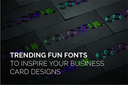
Okay, you’ve waited long enough. Here’s our list of playful, trending fonts:
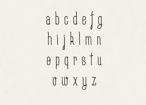
Cute Punk is a typeface that’s both bold and youthful. It’s a stylish and hip type that looks natural paired with hand-drawn design elements.
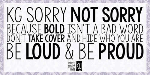
KG Sorry Not Sorry is a type that’s professional yet playful. A great font for startups and small businesses, KG taps into a youthful energy without straying too far into whimsy.
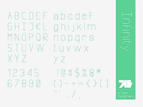
A popular sans serif font for a minimalist aesthetic, Infinity is modern and easily legible. Unlike many ultra-thin sans serifs, this font stands out well against both light and dark backgrounds.
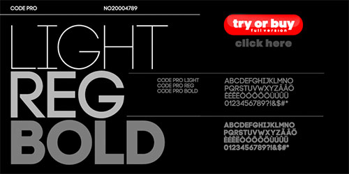
A strong and defined typeface with a no-nonsense approach, Code is a modern version of traditional sans serif favorites. Code can be used in varying weights to create a striking contrast without having to select several typefaces. A real minimalist’s delight!
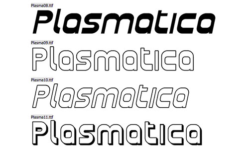
A classic that’s come back from the dead? The Mid-century modern feel of Plasmatica hasn’t ever gone out of style, but it’s here with resurgent popularity nonetheless. This typeface is a throwback favorite with a youthful urgency.
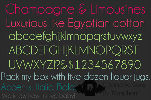
Elegant and stripped down, Champagne and Limousines is a sophisticated typeface that’s perfectly suited for high society companies. This sans serif type is the perfect look for boutique shops, restaurants and cafes, and much more.
And of course, remember to pair the right font with add-ons like raised UV and foil to get the maximum impact from your design.
Want to see what we’ve got? Request a sample from us today!