
Written by Henry Fan · Founder, SilkCards
28 years turning ink, foil, and pressure into first impressions that don’t get forgotten.
In This Article
- What Most Designers Mean by Die Cut, And What It Can Actually Be
- The Magic Is on the Face, Not the Edges
- From 2D Canvas to 3D Architecture: The Designer’s Realization
- The Goldilocks Rule of Die Cut: Minimal Versus Maximal
- Design Considerations Before You Send the File
- When Die Cut Combines With Other Finishes
- Frequently Asked Questions
- Why It Matters: A Note on the Real Value of Print
There is a moment that happens in my conversations with designers. After 28 years I can recognize it before they say a word. We are talking through a die cut project, and I show them what is actually possible. Not just the custom shape they came to discuss. Face cuts that reveal the layer beneath. Interior reveals that turn a card into a small piece of architecture. Their eyes change. I can see their mind drift away from our conversation. In their creative minds they are already designing the next card with this new technique. They are no longer in the meeting with me. They are in the studio. The gate has opened.
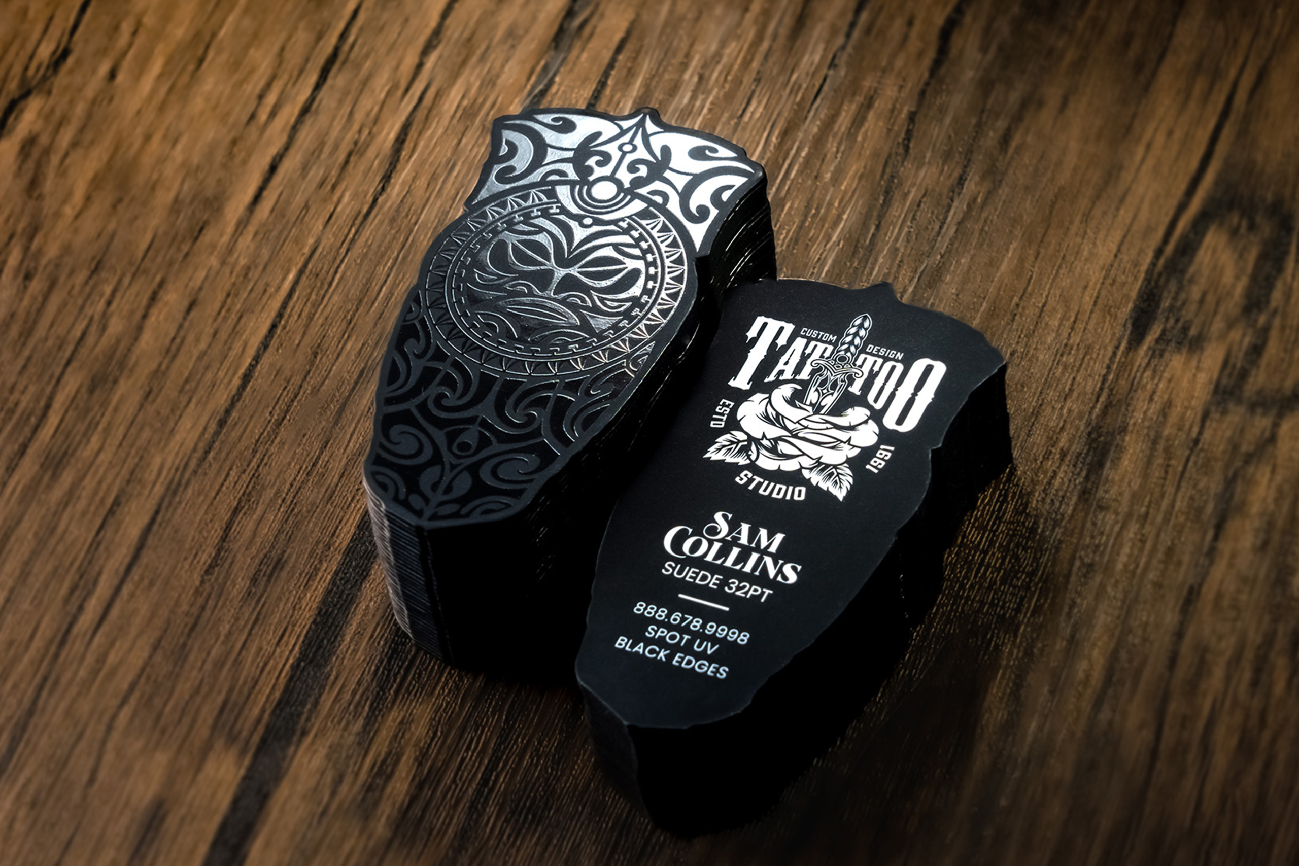
That moment is what this article is about. In fact, most designers who specify die cut business cards are thinking about exterior shape. A circle. A leaf. A custom outline that fits the brand. That is one version of die cut, and it is the version every printer offers. SilkCards offers something the rest of the field does not: die cut through bonded laminated layers. The cut itself becomes a design surface. The interior of the card becomes visible through the cut. We call this through-layer die cut. The entire SilkCards Die Cut Business Cards product line is built around it. I have been operating this construction in our own facility for over a decade. What follows is the founder’s view of what it does, when to use it, and when to hold back.
What Most Designers Mean by Die Cut, And What It Can Actually Be
For example, ask ten designers what a die cut business card is, and nine will describe the same thing: a card cut into a custom shape. A rounded corner. A leaf silhouette. A circle. A semi-custom outline that turns a rectangle into something more memorable. This is the industry-standard definition. It fills the product pages of most premium printers. It is also the version reflected in almost every design inspiration listicle written about die cut over the past five years.
That definition is not wrong. However, it is incomplete. A die cut is fundamentally a precision shape cut by a steel rule die or a laser. The same equipment that can cut an outline can also cut through specific regions of the card face. The question is not whether the cut goes around the card. The question is whether the cut goes through something behind it. On a single-sheet die cut card, there is nothing behind the cut. The card is one layer of paper. The cut becomes a window that opens onto whatever the card is resting against, which is to say nothing.
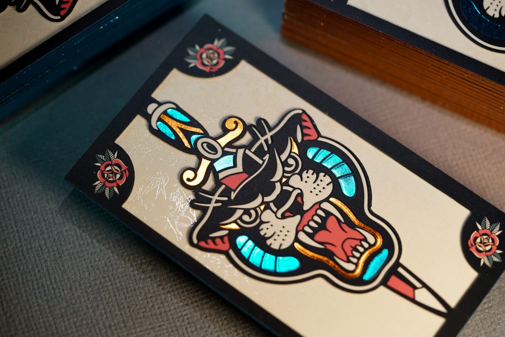
On a SilkCards card built with multiple layers, the cut goes through something. That something is the design surface most printers never consider, because most printers cannot offer it.
The Magic Is on the Face, Not the Edges
First, here is the construction that makes the difference, in plain language. A SilkCards 32pt business card is two individually finished 16pt sheets bonded together. A 48pt is three. Each layer can carry its own color, its own surface finish, its own design treatment, before any layer is bonded to the next. This is the True Layered Architecture that underwrites our entire premium card line. Die cut is what makes the architecture visible.
When the top 16pt layer is cut in a specific region of the face, the layer beneath that cut becomes visible. A circular cut through the top layer of a 32pt card reveals the second layer’s color, finish, or material. A logo-shaped cut reveals a contrasting interior. A precise window cut can expose a foil sandwich layer placed between the two sheets. The sandwich foil is placed specifically to be seen through the cut. The design surface is no longer two faces of one card. It is the architecture of the card itself.
This is the sentence that defines the category SilkCards occupies: most die cuts cut through a single sheet. SilkCards cuts through bonded laminated layers, where the cut edge reveals the architecture of the card itself. Most premium printers cannot reach this category. Standard die cut techniques apply to one sheet of paper. Through-layer die cut requires layered architecture. That requires individually finished sheets bonded together. Most premium printers do not have this construction. They cannot produce a card with an interior reveal because they cannot produce a card with an interior to reveal.
Additionally, our companion article on premium business card cardstock covers the construction story from the cardstock side. The same bonded-and-finished layered architecture makes thick SilkCards cards feel premium in the hand. It is also what makes through-layer die cut possible in the first place. The two are the same engineering, expressed two different ways.
As a result, the moment I described in the opening is what the recipient experiences. Their fingers run across the cut edge of a card and find texture that has no equivalent in their card holder. The cut has depth they can feel. The card has an interior that the cut has made visible. The architecture is no longer abstract. It is in their hand.
From 2D Canvas to 3D Architecture: The Designer’s Realization
The shift that happens in a designer’s mind when they understand through-layer die cut is structural, not incremental. It is the same shift that happened to video game designers in the late 1980s and early 1990s. The medium moved from 2D to 3D. The restrictive design space of a 2D canvas opened up. Suddenly, gameplay could include depth, perspective, occlusion, and the things you could see versus the things hidden behind them. Designers who had spent careers thinking in two dimensions had to learn to think in three. The result was a richer medium that delivered experiences the earlier form could not.
Similarly, through-layer die cut is the same kind of expansion for business card design. A 2D canvas of one face of one card becomes a 3D architecture of layers, cuts, and reveals. The designer is no longer designing onto a surface. They are designing through the card. The cut is a moment of depth in a medium that is usually flat. The interior reveal is occlusion in reverse: hiding something inside the card so that the cut can show it.
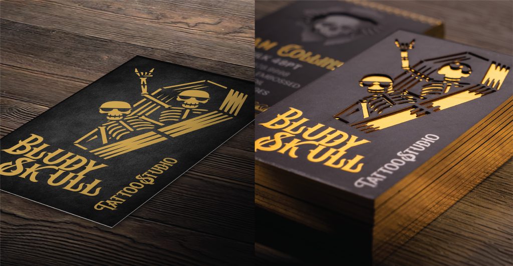
What designers reach for once this expansion lands is what makes the SilkCards product line distinct from the standard die cut category. A pull-tab mechanic where the cut layer slides to reveal a second message. A window cut that frames the interior color core. A silhouette cut that exposes wood veneer or a textured material bonded between the laminated layers. A negative-space cut where the absence becomes part of the brand mark. None of these are possible on a single-sheet card, because none of these have anywhere to point. On a layered card, the cut points inward, and inward is where the design now lives.
Notably, this is also the moment when designers most often want to call their client back. The brief was for “a die cut business card.” The conversation shifts. The new question is: what is your card actually about, and what would your card become if it could show its inside as part of its outside. That is not a feature conversation. It is a creative direction conversation, and it usually changes the project.
The Goldilocks Rule of Die Cut: Minimal Versus Maximal
Once a designer realizes through-layer die cut is available, the first temptation is to use it everywhere. Cut more. Reveal more. Make the card a lattice of windows that shows off the architecture from every angle. This is rarely the right move, and the reason is the same reason any premium business card is premium in the first place: touch.
The principle is simple. In other words, the more paper you remove from the face of the card, the less the hand can feel the texture of the paper. A SilkCards 32pt card has presence in the hand because the layers carry weight and the surface carries finish. When you cut away too much of the face, you remove the very thing that makes the card register as premium. Die cut and tactile premium are in tension. The designer’s job is to choose the balance based on what the brand needs the card to do.
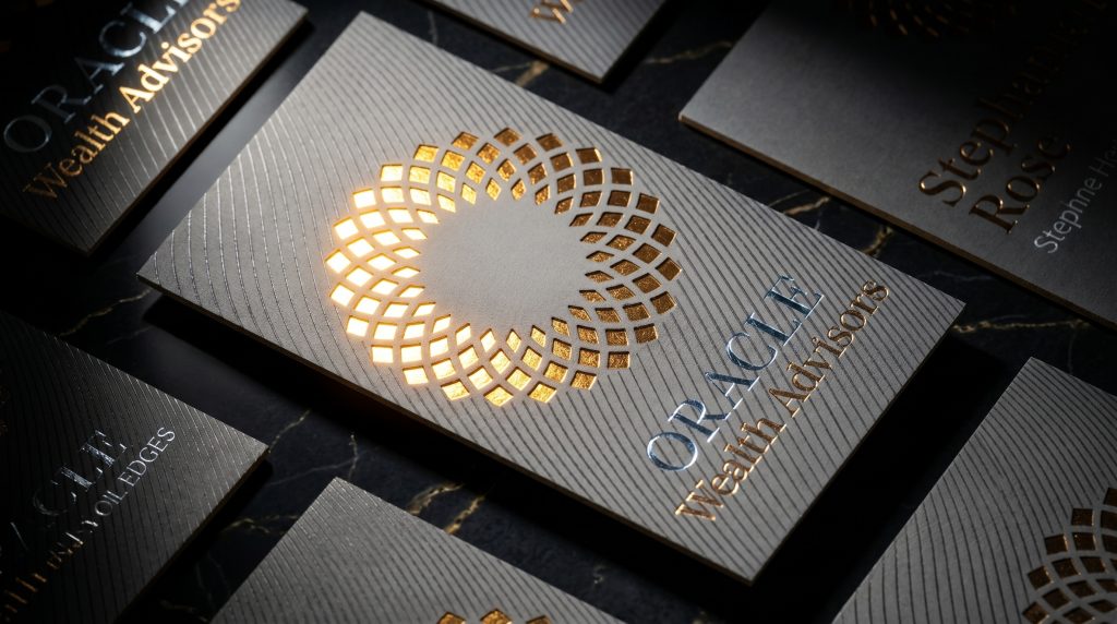
For example, some of the best work I have produced uses minimal die cut. A small flame cut on a red catering card emphasizes the logo without compromising the surface that the hand will hold. The card still feels solid. The die cut is the punctuation, not the sentence. Other cards live at the maximal end. A black and orange card for a creative agency named Unlimited Creative carries an elaborate cloud-shape die cut. The cut fragments the surface into intricate patterns. That card has less paper to hold than the catering card, and that is the point. The brand promised unlimited creativity, and the card surface delivers on the promise by becoming the negative space that surrounds it. Restraint serves the logo statement. Maximalism serves the brand whose purpose is to break the frame. Both are correct for what they are doing.
The Goldilocks question for any die cut design is: how much paper can I remove before the card stops being premium to hold? The answer changes based on the brand. The instinct that drives the answer is the same instinct that drove the original decision to specify a SilkCards card in the first place. Touch matters. The cut serves the touch, or it competes with it. The designer chooses.
Design Considerations Before You Send the File
A face cut on a layered card opens a Pandora’s box of possibilities. A few of those possibilities require design awareness before the file is finalized. None of these are deal-breakers. They are constraints that, once understood, become part of the design vocabulary.
Closed interior shapes need physical access
A simple example is the letter B. The cut outline of the B is straightforward. But the two interior counters — the closed loops inside the upper and lower bowls of the letter — do not connect to any solid element. The designer must address them as separate cut regions. This is true for any letterform with closed interior counters: A, B, D, O, P, Q, R. Designers using letterforms as the cut shape should plan for this in the file, or accept that the counter shapes will read differently than the outline suggests.
Sharp points lose surface area for bonding
When a face cut design includes very sharp points, the paper at the point has minimal surface area connecting it to the rest of the card. On a bonded multi-layer construction, this matters because the bond between layers needs surface area to hold. Sharp points work. The designer should know that pure razor-sharp angles convert better when softened by a small radius. The alternative is to accept that very sharp points will be the most fragile region of the card.
The cut path is a real edge
Every cut in the face becomes an edge the recipient’s finger will run across. A complex cut design produces a long total edge length. The recipient’s fingertip perceives every centimeter of that edge. This is part of what makes through-layer die cut so memorable, and it is also a reason to think carefully about how the cut path traces. Smooth curves read differently than jagged edges. Both can work. Neither happens by accident.
Beyond these specifics, ninety percent of design challenges come into our facility, and our production team solves them with the designer’s intent in mind. The principle I teach our staff is straightforward: do not say no to a customer’s design request for a production challenge. Find a way. That is how we discover new techniques and how new product lines emerge. We accept the challenge.
When Die Cut Combines With Other Finishes
Through-layer die cut becomes more powerful when it combines with the other premium finishes the SilkCards architecture supports. Three combinations come up most often in designer conversations:
Die cut plus interior foil
A foil layer sits between the bonded sheets, and the face cut reveals it. The reveal produces a metallic interior that reads as built-in rather than surface-applied. The foil shows only where the cut allows, which gives the metallic moment intentionality. The contrast between the matte or suede surface of the face and the foil glint visible through the cut is one of the strongest tactile-visual contrasts available in print.
Die cut plus edge painting
The cut edge of a through-layer die cut design exposes the layers in cross-section. Painted edges on the perimeter of the card carry through that color story. The relationship between the perimeter edge color and the cut-window interior reveal becomes a unified design system rather than two separate finishes. Designers who think in palette systems find this combination particularly satisfying.
Die cut plus raised UV or spot UV
Adding a raised UV element near or around a face cut produces the haptic moment described earlier in this article. The recipient’s finger runs across smooth paper, into the topographic rise of the UV, across the cut edge, and back to smooth paper. Four distinct surface states across the path of a single fingertip. This is the kind of design that gets remembered because the hand cannot help but trace the route again.
The SilkCards Die Cut Business Cards product page documents the full range of combinations available across our finish system. The point of naming them here is to give the designer a starting vocabulary. The actual finish combination decisions are creative direction calls that get made on the brief, not on the spec sheet.
Frequently Asked Questions
Standard die cut cuts a custom outline shape into a single sheet of paper, usually around the perimeter of the card. Through-layer die cut, which SilkCards offers as part of its Die Cut Business Cards product line, cuts through specific regions of the card face on a multi-layer bonded construction, allowing the interior layer to become visible through the cut. The difference is structural: standard die cut shapes the exterior; through-layer die cut reveals the architecture.
Through-layer die cut requires a multi-layer bonded construction. SilkCards’ 32pt cards are made of two individually finished 16pt sheets bonded together, and our 48pt cards are made of three. Both thicknesses support through-layer face cuts. A single-sheet 14pt or 16pt card has no interior layer to reveal, so face cuts on those thicknesses become open windows rather than interior reveals.
Common interior reveal materials include contrasting paper colors, foil sandwich layers (gold, silver, holographic, or custom foil colors), and textured substrates such as wood veneer for specialty applications. The interior material is selected at the architecture stage, before any layer is bonded. Designers should plan the interior reveal as part of the original design intent, not as a finish added after.
Most shapes work. Two design patterns require extra planning: letterforms with closed interior counters (A, B, D, O, P, Q, R) need their interior shapes addressed as separate cut regions, and very sharp points need either softened radii or designer awareness that they will be the most fragile region of the card. Beyond those, our production team works with designers to find a way through most complex cut requests.
The more paper removed from the face of the card, the less the hand can feel the surface texture of the paper. Minimal face cuts preserve the tactile premium of the card. Maximal face cuts trade some of that tactile presence for visual complexity. Both approaches work, depending on what the brand needs the card to communicate. The designer chooses the balance based on whether the cut serves the touch or competes with it.
Why It Matters: A Note on the Real Value of Print
I want to close with something that is not about die cut specifically. It is about why I have spent 28 years building a company around this work, and why the through-layer die cut capability is the one we built our flagship product line around.
I was brought up to believe that if you want to do something, you should do it with passion, or not do it at all. From the time I was twelve delivering Chinese food, to sixteen working my first office job, to starting this business, I have put my full effort and passion into the work in front of me. What I mean by passion is doing something that breaks the mold of the status quo. Being you. Being different. Finding the niche where you can excel and be passionate about what you do every day from the moment you wake up. Knowing that what you do, others can’t.
Through-layer die cut is one of those moments for SilkCards. It is a capability we built because no one else was building it, and because it lets designers do something on a business card that they could not do anywhere else. The reason that matters is not the feature itself. It is what the feature makes possible for the person who eventually holds the card. In print, it’s not just paper, ink, and labor that’s of value. It is what this paper, ink, and labor outcome can do for a person. That is the real value.
A business card is small. It is also the first move many professionals make in a room. The cut on the face, the reveal of the interior, the moment the recipient’s finger registers something they have never felt before, these are not features. They are the medium through which a designer’s idea reaches another human being. SilkCards exists to make that medium worth using.
Ready to design a card with this architecture?
Explore the SilkCards Die Cut Business Cards product line. Order a free sample kit to feel through-layer die cut, edge treatments, and our full finish range in your own hand before you spec your next project.