
Have you grown weary of seeing plain white business cards with black text? More and more people are straying from the old standard these days in order to promote their businesses and stand out. The right selection of colors, fonts, and logos can boost engagement with your business, which translates to more clients and more revenue for you.
However, it’s crucial to be clever with your colors. Too many loud hues can clash with one another and clutter your card with visual noise. To be strategic with your color and design choices, read our extensive guide to pairing colors on your business cards and take a creative approach.
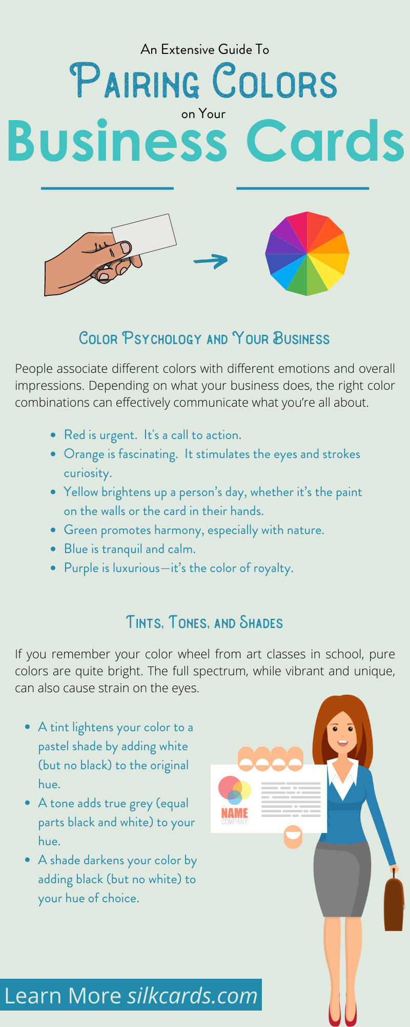
Color Psychology and Your Business
People associate different colors with different emotions and overall impressions. Depending on what your business does, the right color combinations can effectively communicate what you’re all about. What are your options? Think about how they mesh with your vision for your business.
- Red is urgent. It’s a call to action. Whether it’s an expression of power or passion, different varieties of red make a person feel as if they need something. Many fast-food restaurants use red in their interiors because it’s believed to make people feel hungrier.
- Orange is fascinating. It stimulates the eyes and stokes curiosity. Orange combines the power of red with the sunny optimism of yellow. Hand a potential client an orange card, and they’ll want to know more about your business right away.
- Yellow brightens up a person’s day, whether it’s the paint on the walls or the card in their hands. If your business offers something new—a new niche, a fresh idea—yellow can draw customers in.
- Green promotes harmony, especially with nature. Is the outdoors a part of your business, whether you’re a florist or a landscaper? Shades of green will get your message across.
- Blue is tranquil and calm. It’s the color of a cloudless sky and, through reflection, a still body of water. It’s commonly associated with spirituality and speaks to the integrity of your business.
- Purple is luxurious—it’s the color of royalty. With the power of red and the serenity of blue, purple evokes the stability and wisdom of a sage ruler. It’s authoritative without being too stark.
Other colors to consider include:
- Brown is down-to-earth—literally. While pink is youthful and light, brown is stable, wise, and relays experience. A brown card tells potential clients that you know what you’re doing and have been doing it for a long time.
- Black is elegant but mysterious. With a bright and classy font printed or embossed, you can portray your business as luxurious yet still on the cutting edge.
- White is crisp and clean and signifies a fresh start. Without any color accenting it, though, it can also be boring and blank. Design is key! Try using white as the accent color to bring a bright pop to your logo or border.
Tints, Tones, and Shades
If you remember your color wheel from art classes in school, pure colors are quite bright. The full spectrum, while vibrant and unique, can also cause strain on the eyes. Luckily, you don’t have to use fully saturated pigments on your card. You’ve got even more creative options!
- A tint lightens your color to a pastel shade by adding white (but no black) to the original hue. Pink is one of the most common tints, but you can also use lavender, baby blue, or a friendly pale yellow. If your business specializes in wedding planning, baby photography, or personal care products, pastel tints convey your message well.
- A tone adds true grey (equal parts black and white) to your hue. Have you heard the phrase “tone it down” before? If your chosen color looks too bright, you can reduce eye strain by adding a little grey.
- A shade darkens your color by adding black (but no white) to your hue of choice. This is how you get those rich jewel tones that convey a luxurious feel. Stop-sign red turns to a velvety burgundy with the right amount of black.
Color Theory and Pairing
To add visual appeal to your specialty business cards, use more than one color. A plain green card catches a potential client’s attention, but it doesn’t retain it for long. Strategize how you’ll pair colors together by looking at the color wheel more closely. Notice how the colors line up and interact with each other.
- Complementary colors are right across from one another. They’re often called “opposite” colors. Red and green are a popular pair commonly associated with Christmas. Try using a tint of one color for your background and a shade of the other for your text, like pale yellow and deep purple.
- Analogous colors are neighbors! A smooth palette of violets and pinks can increase engagement with your beauty brand, while a wash of blues and turquoises can entice clients to your spa. Remember your color psychology as you choose which colors match each other—and your business’s goals. Analogous color schemes are easy on the eyes, as they don’t contrast one another too much. Businesses that specialize in relaxation and self-care often choose analogous palettes.
- Triadic colors create a perfect equilateral triangle across from one another and can really draw the eyes in! If you don’t have a color wheel handy, remember that this color combination spells out the whole rainbow. Red-orange (a fiery vermilion), yellow-green (a happy chartreuse), and blue-violet (an intriguing indigo) are triadic colors. Business cards with triadic color schemes are sure to stay in potential clients’ wallets for longer.
To create business cards that will entice clients and increase engagement with your business, take the time to pick the perfect color palette. It’ll pay off in the long run! You don’t have to be a professional artist or graphic designer to use color theory to your advantage. Consult with Silk Cards for personalized advice on how to create your ideal card, and choose colors that enhance your message. Bookmark our extensive guide to pairing colors on your business cards and don’t be afraid to get adventurous. Show pride in your business by creating the best marketing materials possible!