
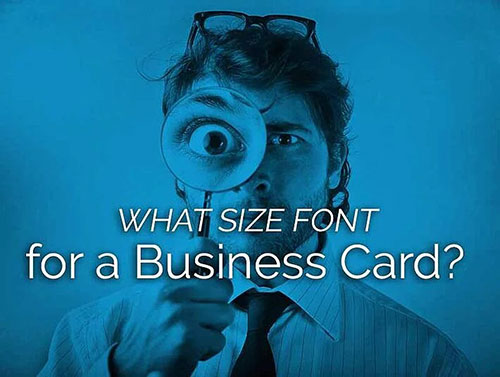
When designing a business card, you need to ensure that your brand conveys the right message and that your text is readable and clear. This can be a challenge since a business card is so small, so how do you know what size font to choose for a business card?
Business Card Font Size: Are You Using Fonts That Are Too Small?
One of the biggest mistakes is to choose a small font simply so that you can cram a ton of information on that 3.5 x 2 inch rectangle.
Related: Standard Business Card Sizes You Should Be Using
Given the size of the card, there are two things to keep in mind when choosing a business card font size:
- Two small would make it hard to read, yet a business card is typically viewed up close.
- Too large takes up valuable business card real estate.
A font size of 10-11 pt is perfect for body text, and 7-8 pt can be used for the contact information. However, this is by no means a rule of thumb.
It Really Depends on Your Design
Larger and bolder fonts can be utilized for emphasis, and size really depends on the card’s layout and design. If you find yourself running out of space, consider using double-sided cards.
Related: Creative Ways to Use the Back of a Business Card
Things to keep in mind when choosing your font size:
- Branding guidelines: Your brand may have a specific font it uses that just does not look good when it’s small.
- Card design: You may have to adjust or alter depending on the business card layout.
- Content: If you have a lot of content, don’t just simply go smaller and smaller with size. You’ll want to avoid the small and faint. Use a bold font weight if necessary.
Related: What’s the Difference Between Typeface and Font?
Choosing the Right Business Card Font
Assuming that you do not have specifications in your brand style guide that determines what font to use, here are some general font rules that work well and ensure readability on some of the best business cards:
Serifs
Serif fonts, or fonts that have the small decorative bars at the ends of each character, tend to be a little bit harder to read than serifs, or those without. However, they do convey a more formal typewriter-like touch. These fonts will have to be a tad larger than plain sans serif fonts.
Helpful Example – Times New Roman: This font is super easy to read, but it is one of the more common fonts. To make it look more unique, use variations and styling options such as italicizing. One option is to also use it for the plainer areas of the card such as the contact information.
Sans Serifs
So long as the font weight is thick enough, sans serifs are the easiest to read of all the types of fonts because they contain no unnecessary flourishes. The straight, clean lines convey a lack of clutter, and you can use them at smaller sizes than other fonts without losing much.
Helpful Example – Myriad Pro: This font is perfect for professional business cards. The neat upper case letters and also the rounded tails make it look both classy and formal.
Scripts or Specialty Fonts
Scripts are extremely hard to read, and some specialty fonts are as well. The best course of action is to use them sparingly, just enough to convey your branding properly, and make them as large as possible for readability.
Helpful Example – Karat: If your brand is a little more informal, you could use this font. The curved letters make it look more playful than fonts designed for formal audiences.
Related: When Is It Acceptable to Use a Script Font in a Design?
If designing your business card is giving you the blues, our design team can take care of the process for you. You’ll not only benefit from getting the right sizes nailed down, but the final product will also reflect your brand and impress anyone you hand your card over to. Don’t believe us? Request a FREE sample pack.