
We’ve discussed at length this month the importance of real estate business cards and branding. In such a competitive space where word of mouth and networking is everything, you want to remain top of mind after you’ve already left or concluded your meeting. Unfortunately, 88% of business cards get thrown out within one week of handing them out. So what makes a successful REALTOR business card?
Related: 17 Real Estate Business Cards That Close Deals
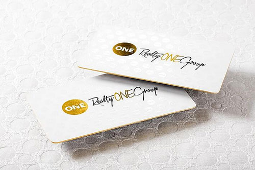
We’ve taken one of the best cards we’ve seen and what makes it so special. Leigh Crowe from Realty One Group owns this stunning card.
Anatomy of a FANTASTIC REALTOR Business Card
Are you ready to take a tour through its design?
1. Personal Branding
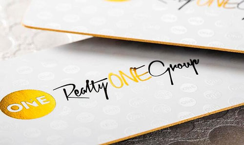
Let’s talk the logo first. We have the monogram that is the exact one used by the broker, Realty One Group, but the cursive lettering and color is different. This allows the agent to pay homage to the broker while still retaining a sense of personal branding and identity.
Related: Types of Logos: Choosing a Brand Logo Design that Appeals to the Masses
2. Minimalist Design on One Side
The white background makes the card look really clean, and the gold foil is what makes the card avoid looking too plain. The gold foil and white together is really crisp and clean but also conveys a sort of luxury to the brand.
From the angle on this picture, we can faintly see a spot UV watermark of the monogram, an excellent use of subtle texture and pattern.
Related: What Should Go in the Background of My Business Card?
3. Colored Edges
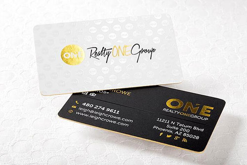
Check out the colored edges on this business card. This is the other element that makes this card so well executed despite having a flat white background. The gold color really makes the card pop both from the side and straight on.
The 32 pt thickness of the card really puts weight in someone’s hand, and the rounded edges gives the card a little more unique shape to stand out from other business cards.
Related: 5 Ways to Stand Out from Other Real Estate Agents
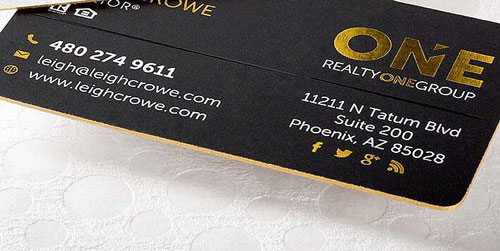
The back utilizes a darker background, but the gold foil on this business card is perfect on both white and black backgrounds.
4. Font Color
The use of white text works with the branding on the other side and keeps the card from looking too busy with just the foil. All of the icons still use gold, giving them a little bit of emphasis and character.
5. Scannability
There’s a spot UV line separating the header from the contact information, compartmentalizing the different sections for easy reading.
Related: Should You Have a Headshot on Your Business Cards?
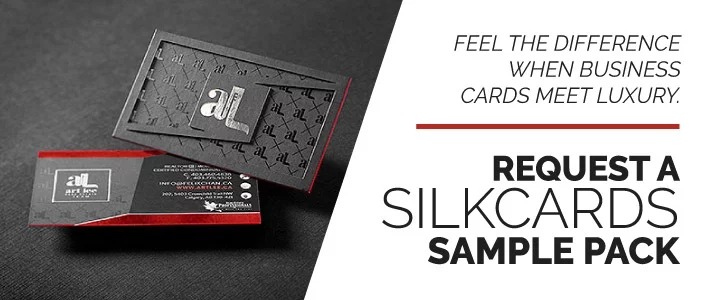
Get Advice From the Experts Who Know Business Cards
At SILKCARDS, we were committed to getting Leigh the card that would represent her the best, and we want to do the same for you. If you’d like to read a personal account from another real estate agent about what her cards mean to her, check out our customer spotlight with Lysandra Bailen.
By working with our design team, you’ll have the chance to bring your ideas for your brand to life.