
Sometimes, an abundance of choices makes decisions more difficult. Still, in todays’ business card world, the many choices give businesspeople a fabulous array of choices so they can stand out amongst the competition. Think about it—whose business cards do you remember? The answer is probably the ones that made you stop and stare a little longer. A well-designed business card doesn’t just look unique; it also has a font style that is easy to read. In this article, we’ll take a look at the easiest fonts to read on print to give you an idea of what to look for, and we’ll also discuss how font truly makes a difference for business cards.
Why Font Matters
Font says more than the words it creates. Your personality or at least the personality of your business is assumed quite quickly from the writing on your business cards. Like it or not, once it’s passed along, a business card is judged. There are 3 areas to consider when choosing a font: Who’s the audience, what is the font saying, and what makes a good font. Let’s look at all three:
Who Is the Audience?
First things first, always consider the audience when choosing the best font for your business cards. Are your customers fun and outgoing or serious and reserved? It’s important to understand how others view your business and also how you want it viewed. A chalkboard type font looks whimsical and casual, however, if you’re a law office, that type of font won’t serve you well even if you simply like how it looks. That brings us to the next point:
What Does the Font Say?
Font always says something. It’s up to the designer to make sure it says the right thing. The font on a business card tells us if the business is new, old, hip and trendy, or classic and stable. It truly can say whatever is necessary. When choosing a font for print, not only should you look for the easiest fonts to read on print, but you should also imagine the font if it were handed to you on a business card. Would you know what the business is about just by reading it and judging the font? If not, then try a different avenue.
What Makes a Good Font?
A good font combines everything we’ve discussed—the audience, their personality, and the business’s personality, and it clearly states those things. On top of those two ideas, a good font is easy to read while still looking stylish. There are some beautiful fonts that look stunning but are so detailed that no one can read them well. They have their place, but you want a font that looks good and is easily and quickly legible; if not, customers might move on to the next card. There are a few technical ideas that lend to a good or bad font:
- – Serifs: In certain typefaces, there are strokes that come off of the lines of each character. Those are called serifs. As a rule, serif fonts are tougher to read (though often elegant) than those without. Still, it’s a general rule, and we sometimes find a serif that happily breaks the rules.
- – Spacing: In every font, the characters have space between them, but some more than others. This is called leading, kerning, or tracking. Often, when the space is quite close between characters, the font is tougher to read. In that case, it’s probably not the font to go with.
- – Size: Size matters in a font choice. A font size of 10 makes a difference in the ease of readability when compared to a 12. Sometimes, we’re left with little choice when a lot of information must go on the business card. Still, it’s best to make it as large as possible while still getting your point across.
Readable Fonts
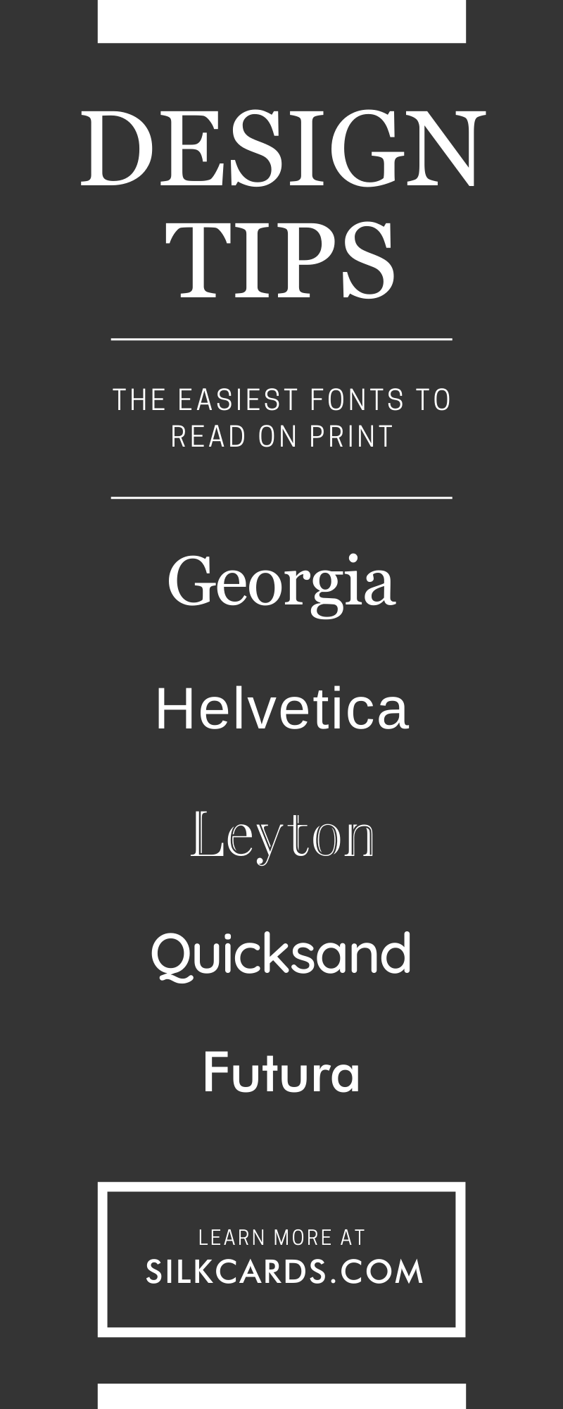
We’ve put together a list of fonts that are considered easy to read on print to help when you’re struggling to choose a font yourself. Here are a few of the best contenders:
- – Georgia: Created for Microsoft, Georgia is actually a serif font with a small line attached to each character for embellishment. Even as a serif, Georgia is very readable.
- – Helvetica: Very popular all over the world and considered a classic, Helvetica is considered a sans-serif.
- – Myriad Pro: Apple chose Myriad Pro for their user manuals and was the corporation’s go-to from 2002-2017. It’s simple and never distracts from the other elements on a business card.
- – Leyton: This font says “elegance and luxury” while still being readable.
- – Quicksand: Quicksand is designed with geometric shapes in mind and is said to feel friendly.
- – Times New Roman: Considered simple yet sophisticated, Times New Roman has been around in print since 1931 and has always been extremely popular. Use this one for a classic, clean look.
- – Baskerville: This font is experienced. Baskerville was created in 1757, so as you can imagine, it’s elegant and a bit old-fashioned (in a good way). Turn to Baskerville font for a bygone era effect.
- – Futura: A sans serif that is also patterned after geometric shapes, Futura has a modern and efficient air about it.
- – Black Caviar: Sometimes a handwritten effect is needed and that’s where black caviar steps in. It has a homemade look to it, yet it’s very readable, which is what makes it unique.
There are hundreds of fonts to choose from, and every business has its own style and needs. The above are simply fonts that are commonly considered easily readable on print. Keep in mind that some fonts that are easy to read on a screen may not read as well in print, and vice versa.
Every aspect of the business card is important, and as a businessperson, you want to get it right the first time. Silk Cards understands this need, and that’s why we design business cards that make potential customers ask how you created such an eye-catching card. Not only can a business card stand out and be memorable, but it also starts a conversation. At Silk Cards, we offer the most unique options, such as foil-embossed business cards, along with many other choices that incorporate the most readable fonts. Contact us today, and don’t put off one of the most important aspects of your business any longer—the business card.