
More than a few business owners and network professionals view business card design as a simple process involving two steps:
- Select a template.
- Add contact information.
Then, they print the version they like best, and that’s the end of the story though it really shouldn’t be.
The Return Is Equal to the Effort You Put In
Your business card can function as a brand representative, your contact’s reminder of the great discussion you shared and the first impression you gave them. Why shouldn’t you send in the best ambassador you can? The reward would be strengthened business connections and relationships as well as a stronger industry presence.
Your core values, your brand identity, general design concerns and the psychology of your visual elements should all be a part of your thought process as you move forward with your business card design. Here are 5 tips for creating a memorable business card that will wow your prospects and business associates.
1. Make It Easy to Read
When your primary goal is to create an impressive design, many people often go overboard with the bells and whistles. Remember that the primary function of your card will be to convey information while making an impression; if that information is too difficult to be found, the practical value of the card is null.
Make the text large enough to read and choose a clear font. Too much script can be hard on the eyes, especially for numbers, so be sure to balance out any fancy styles with plain text in order to convey your details in a clear manner. Be sure to choose colors that contrast to make the text more readable—no pinks on top of purples!
2. Building a Cohesive Look
Your business cards should work in conjunction with your other print and digital marketing materials rather than against them. If your logo has a specific color, run with it. Does your business have a slogan that really represents their products or services? Include that. If you were to lay out all of your promotional materials next to each other on the desk, your business card should look like a member of the family.
3. Utilizing White Space to Your Advantage
This tip doesn’t mean that you need to have a lot of white on your business card. “White space” is a design term that refers to negative—or blank—space that improves readability and gives the readers’ eyes a rest. White space and minimalism is really trendy right now, and for good reason. Having enough blank areas can help them process the information better and lets your other elements stand out more.
Designing with white space in mind is simple:
- Don’t oversize your logo.
- Keep it simple: Only use information that’s necessary.
- Avoid “busy” layouts.
- Use both sides of the card for dispersing info rather than crowding it all on one side.
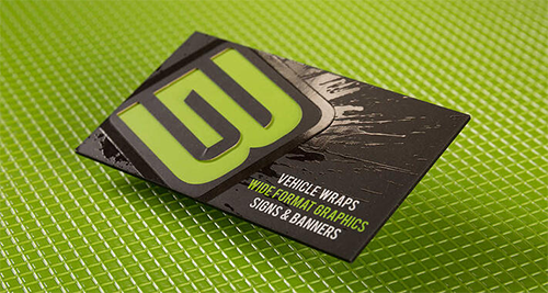
4. Embrace Visual Elements
A business card brings to mind a couple of things: Name, phone number, website, etc. And these should definitely all be present. However, individuals in this day and age tend to respond more positively to visuals than text. Compliment your information with graphics such as your logo or a photograph representative of your industry or body of work.
5. Don’t Be Afraid to Stand Out
Business card templates out there are used time and time again. For people who network regularly, hundreds of business cards can come their way. That’s why the “wow” factor is really important with business cards; you’ll want to ensure that yours stand out from the other professionals in your industry or niche so that you stand out in the minds of everyone you meet.
Here at 4colorprint.com, we offer a variety of different materials and printing techniques to get your business card to the next level. Die cuts, embossing and mixing matte with glossy finishes can all elevate the tactile experience of your business card while foil or UV printing can enhance any design.