Effective business card design is all about storytelling. Foil business cards use subtle touches to give life to that story and transform the experience of giving and receiving a card.
How do you design a foil card that stands out? Here are some of our favorite examples of effective business card designs with foil:
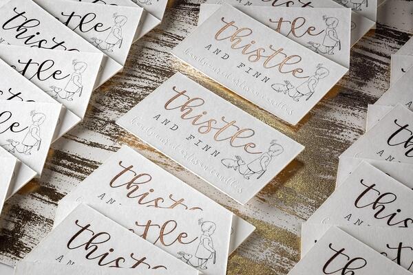
Subtle rose gold foil business cards offer a chic, refined look.
On this card, the foil script in the wordmark make it stand out, especially when set against the debossed accent along the bottom. The foil also introduces a little touch of color to an otherwise black-and-white design.
Choosing this particular rose foil color also adds a whimsical quality to the card.

This new take on the iconic IHOP logo uses foil to frame the card and accentuate its key features. The designer of this card did a marvelous job matching the foil accent to the die-cut solid blue background. The overall effect is a tasty treat for the discerning designer’s eye!
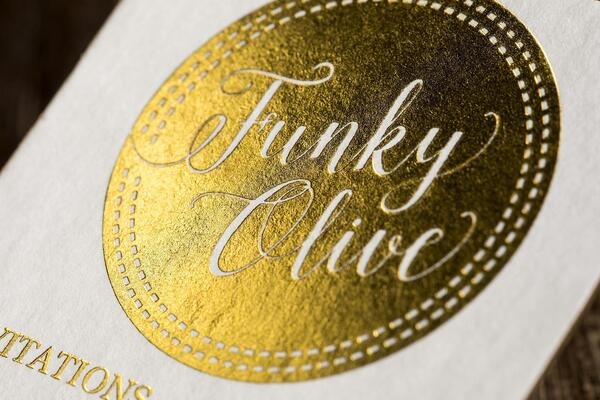
This foil business card is all about texture. It features elegant uncoated/Letterpress paper with text indentation paired with a vibrant gold foil accent.
The paper finish comes through in the negative space in the logo, giving it a refined, vintage quality.
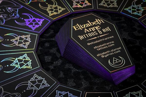
The rainbow foil effect on these unique coffin-themed business cards catches the eye and draws attention to the graphic elements on the front.
For tattoo shops and similar businesses, business cards with custom foil can indicate artistry and creativity to potential customers.
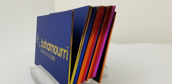
Foil accenting doesn’t just work on the front and back of a business card. Ultra thick cards can be edged with foil to create a unique visual effect.
These multi-color sets of foil cards reflect changes in ambient light, making them stand out even when they’re in a holder or stacked on a desk. For this reason, foil-edged cards are a great choice for networking events, where people will probably leave with a stack of new contacts’ business cards.
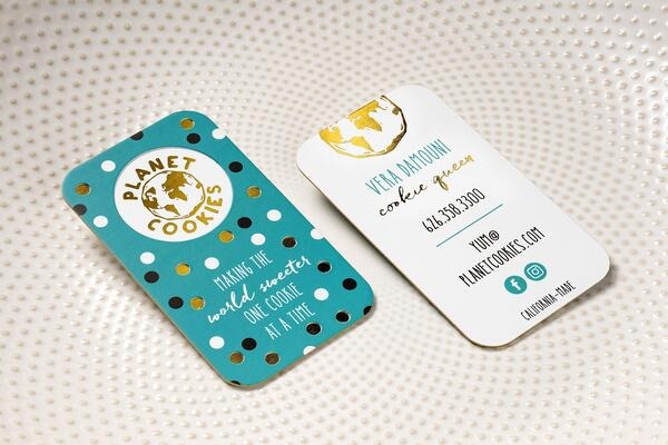
Few paper accents can be used as playfully as foil. Small touches stand out more when given a little dash of glimmer.
Take the dots on the front of this card. They complement the design with a subtle metallic effect that adds a sense of whimsy without being overwhelming. This draws the eye to the foil-accented logo for a pleasing overall composition.

Often, gold foil business cards are either very traditional or very modern. This card stands out because it lands somewhere between old-school and high-tech.
Traditional details like the debossed motif, white paper, and a gold leaf logo combine with a unique Letterpress texture to create a look that’s both minimal and memorable.
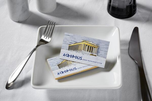
When you hand someone a business card, the goal is to give them an experience. This restaurant business card demonstrates how that experience can be elevated with foil.
The design of this card, centered on the Acropolis and using an iconic Greek-style font, is accentuated with subtle gold foil touches and an eye-catching die-cut that makes a real impact. The attention to detail is what makes a card like this stand out from the crowd, and lends the business immediate credibility. It’s like the recipient has been instantly transported to Athens for lunch. It’s a first impression they will remember.
Learn more with our Designers’ Ultimate Guide to Printing Unique, Custom Business Cards!

