
You have seen what foil does on the right foil business card. The logo catches light in a way that ink cannot replicate. Pick it up, tilt it slightly, and something registers — not about the design, but about the person who handed it to them. You know what foil business cards are capable of. The question is whether you know what range actually exists.
Most designers arrive at foil business cards already knowing gold, silver, and copper. Some printers add a fourth option — rose gold, occasionally a specialty color. The decision tree is short: which of the three standard colors fits the brand? Specify. Done.
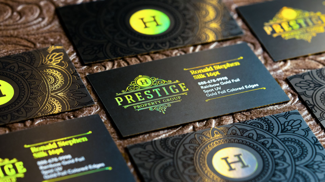
SilkCards foil business cards come in 38 colors organized into five families, each with distinct reflective properties. Not 38 shades of gold. Thirty-eight colors that behave differently from each other in different light conditions — colors that organize into families based on what they do, not just what they look like on a swatch sheet.
This article explains what the full range means for your work. What foil is, how it differs from what most print providers offer, and what becomes possible when the palette has real depth.
What Foil Stamping Is — and Why Foil Business Cards Look Different
Foil stamping is not printing. No ink is deposited. No pigment is suspended in a carrier and pressed into paper fibers.
A thin metallic film — polyester-based, with the color layer facing the substrate — is placed between a heated metal die and the card surface. The die presses down. Heat and pressure fuse the metallic layer to the card at the precise shape of the die. The film backing peels away. What remains is a metallic element that is part of the card surface — not printed on top of it.
This is why foil behaves differently at every angle. The finish is a physical surface with its own geometry, not a layer of color applied to a flat field. Light hits it the way light hits polished metal — it reflects off the surface rather than absorbing into it.
The die is the precision instrument. Its shape determines what receives foil and what does not. On foil business cards, a logo element becomes a foil element when the die is cut to that shape. A firm name becomes foil-stamped when the die carries those letterforms. The die can be cut to anything that can be drawn — but its minimum useful resolution is governed by the mechanics of the process. More on that in file preparation.
Foil can be applied flat — at the surface of the card. Or it can be applied with elevation — building above the surface. These are fundamentally different processes, and they produce fundamentally different results in the hand.
Gold, Silver, and Copper — What the Standard Palette Covers
The standard foil palette for foil business cards at most printers covers three options. Gold. Silver. Copper.
Gold foil is the default premium signal in print. Warm, immediate, broadly legible as authority. On a firm name or a logo mark, gold foil communicates formality before the surrounding design context does anything. It is the foil most clients ask for by name without knowing the alternatives.
Silver foil reads cooler and more modern. It suits brands that associate with technology, precision, or contemporary minimalism. Where gold leans toward established authority, silver suggests forward-looking confidence. The two contrast sharply — the choice between them is a brand decision, not a color preference.
Copper foil runs warmer than gold and carries a distinctiveness that gold does not — it is rarer in the market and, as a result, more immediately memorable. Current design trends have moved toward warm metallics, and copper foil has benefited from that movement.
These three options are sufficient for a large portion of foil business cards applications. When the project calls for one of the three standard metallics, and the finish is flat, and the substrate is coated stock, these options cover the requirement. The limitations become apparent when the design intent moves beyond them.
Foil Business Cards Come in 38 Colors Across Five Families — What the Full Range Actually Means
Standard foil business card printing offers two to four color options. SilkCards offers 38 foil colors organized into five families, each with distinct reflective properties and intended use cases. This is not a product catalog note — it changes what foil means as a design decision.
Each of the five families is organized by how the foil interacts with light, not by hue alone. This matters because two foils can appear similar on a swatch and behave completely differently on a card in use.
The Five Families and What Each One Does
One family produces a warm, solid metallic finish. The color is consistent across viewing angles and consistent across light sources. Gold, silver, and copper live here — but so do colors that no standard palette includes. These are the foils that read clearly at any distance and in any lighting condition.
A second family produces foils that shift. The apparent color changes with the angle of view and the direction of the light source. A foil from this family looks one color under incandescent light and a noticeably different color under daylight. Under fluorescent light, it does something else entirely. This is not an inconsistency — it is the property the family is built around. For foil business cards representing brands whose identity involves movement, transformation, or dual-context communication, this family does something no solid metallic can replicate.
A third family catches and releases light with a micro-movement quality — a shimmer that is visible when the card is turned, rather than when it is held still. It is not glitter. It is a controlled optical behavior that produces the impression of depth within a flat metallic surface.
The remaining two families address further specific reflective behaviors — pearl-spectrum finishes that add warmth without full opacity, and specialty foils that operate differently from metallic norms.
The difference between three options and thirty-eight is not about abundance. It is about specificity. A designer who knows what each family does can specify foil the way they specify a typeface — choosing the medium that produces the exact outcome the brand requires, not the closest available approximation.
Why Range Changes the Design Decision
For the status seeker who hands this card at a firm introduction, this specificity is invisible. What they experience is a card that is exactly right. For the designer who specified it, the foil selection was a decision, not a default.
Flat Foil and Raised Foil — What the Difference Actually Registers
On foil business cards, flat foil and raised foil are not grades of the same thing. They are different mechanical processes that produce different physical results.
Flat foil fuses at the card surface. The foil element is color and reflectivity. It has no height. The hand cannot distinguish it from the substrate by touch — only the eye registers the change.
Raised foil builds above the card surface. The foil is applied with depth, so the element has actual height — a dimension that the hand detects before the eye confirms it. The recipient picks up the card and, before they read a name or register a logo, something in the fingertip reports that this surface is not uniform.
Most raised foil on the market is a single-pass process. One application, uniform height across the entire foil element. This produces foil business cards that have dimensionality — it is measurably better than flat foil in tactile terms — but it operates at a height limit that is set by the single-pass constraint.
Multi-Pass Elevation — What It Changes in the Hand
Multi-pass variable elevation applies foil in multiple passes, at variable heights, within the same card face. A logo mark can build to a height that differs from the name it sits beside. An element that is meant to be the focal point can carry more height than the elements supporting it. The hand encounters a surface that has topography — not just texture, but deliberate variation in what the fingertip finds.
The practical result: clients notice before they look. A card in a stack is identifiable by touch. Handed across a table, it interrupts the moment before the conversation does.
Foil on Suede — What Happens When the Substrate Changes
Foil is most commonly specified on glossy coated stock or uncoated stock. Both work. The results are predictable. On glossy stock, the foil competes — slightly — with the surface around it, because gloss is also reflective. On uncoated stock, the foil adds contrast against a flat field. The result is clean and standard.
On matte suede lamination, the relationship between foil and substrate changes fundamentally.
Matte suede lamination absorbs light. The surface does not reflect — it diffuses. A suede-laminated card held to a light source produces no sheen, no gloss, no competing reflectivity. The surface disappears into its own texture.
Against that field, a foil element is the only reflective surface on the card face. There is no glossy field to dilute it. No surrounding sheen to compete with it. The foil element does not need to assert itself — the substrate has already cleared the space.
Foil on a matte suede-laminated card creates a contrast that foil on glossy or uncoated stock cannot produce: the matte field absorbs light while the foil element reflects it, creating natural visual hierarchy without color contrast. The eye moves to the foil because there is nowhere else for it to go.
Where Foil Works — and Where It Introduces Risk
Understanding the foil business cards range is the first decision. Understanding where foil functions as intended is the second.
Logos and brand marks are foil’s natural application. A contained area, designed to hold visual weight, with sufficient stroke width to register cleanly from the die. Most logos work well with foil. The exceptions are below.
Firm names and professional titles in foil add hierarchy before the surrounding design context does. A name in raised foil on the front of a card is felt before it is read.
Where Foil Introduces Risk
Fine detail, hairline strokes, and small type introduce registration risk. Foil is applied from a die. The die has a minimum resolution — elements below approximately 0.75pt stroke weight risk filling in or registering imprecisely under pressure. Type below 8pt, depending on the font’s stroke characteristics, may not hold clean edges. If the design includes these elements in foil, this is the conversation to have with the printer before the file is finalized, not after.
Full-coverage foil on foil business cards — an entire card face in foil — is rarely done well and almost always done in excess. When it works, it is because the surrounding design has accounted for the absence of any matte field. The foil has nowhere to contrast against, and the card reads as monolithic rather than deliberate. The case for full coverage is narrow.
Decorative borders and frames are common foil applications. They are also the most frequently over-specified element — a border that uses foil because foil is available, not because the border needs to be the focal point. Foil used as habit rather than intention competes with the elements that should lead.
The question that governs every placement decision: what on this card needs to be the first thing the eye registers? Foil answers that question. It cannot answer it for three elements simultaneously.
Preparing Your Foil Business Cards Files for Printing
Foil on foil business cards is applied from a die, not printed from a composite file. The design process must account for this.
The foil layer is separate. In your file, create a dedicated spot color layer labeled clearly for foil — “FOIL,” “SPOT FOIL,” or a named Pantone designation your printer specifies. This layer becomes the die specification. Everything on this layer receives foil. Nothing on this layer receives ink. The layers do not overlap in production.
Minimum stroke weight. For foil to register cleanly, no stroke in the foil layer should fall below 0.75pt. At hairline weights, the die cannot cut and press with sufficient precision to hold the edge. The result is a foil element with soft or merged borders — legible at a distance but failing at close inspection. For clients who will look closely at the card before deciding whether to keep it (every creative professional, every attorney), this is the failure that matters.
Type Size, Multi-Foil, and When to Call Before You Design
Minimum type size. The threshold varies by typeface — a light-weight sans-serif at 8pt behaves differently than a medium-weight serif at the same size. The practical floor for most typefaces in foil is 8–9pt. If your design requires foil on text smaller than this, the conversation with the printer should happen at the concept stage.
Multi-foil designs. If the design uses two or more foil colors on a single card face, each color requires its own die layer. Label each layer distinctly. Separate die layers allow each color to be applied in sequence. Specify which layer receives which foil color explicitly — do not leave this inference to the production team.
When to contact the printer before you design. If your concept includes raised foil on one element and flat foil on another, contact the printer at the concept stage. If any foil element is smaller than 6pt or involves a design detail you are uncertain will register, contact the printer at the concept stage. File problems discovered at proofing cost turnaround time. File problems discovered in production cost production.
Frequently Asked Questions
Common Questions About Foil Business Cards
Gold ink and gold foil are produced by different processes and produce different results. Gold ink is pigment-based — metallic particles in a carrier, deposited onto the surface like any other printed color. The result is matte-to-semi-gloss, with metallic quality that is visible but not reflective at the same level as actual metallic film. Gold foil is a metallic film heat-fused to the card surface — no ink, no carrier. The result is a fully reflective metallic finish that behaves like polished metal under light. The two are not interchangeable in appearance or performance.
Yes. Multiple foil colors can be applied to a single card face using separate die layers, each applied in sequence. The design file must designate each foil color on its own spot color layer. The constraint is design intent: each additional foil color adds a reflective element competing for the eye’s attention. Two foil colors used with clear hierarchy work. Two foil colors at equal visual weight fight each other. The file process supports multi-foil; the design intent should drive whether it serves the card.
More About Foil Stamping
Foil works well on dark stock. The contrast between a dark matte field and a reflective foil element is often stronger than the same contrast on white or light stock. Gold foil on a black card communicates authority at a level that gold foil on white cannot. The practical consideration: the foil color must be selected for legibility against the dark substrate. Lighter foil options — certain pearl and specialty colors — may read less clearly against very dark backgrounds than solid metallic options. The selection process is the same; the criterion for legibility shifts.
Foil stamping is a fused surface, not an applied film layer. The metallic element is bonded to the card substrate through heat and pressure. Under normal handling — the card being removed from a wallet, passed across a table, stored with other cards — foil does not peel. The failure mode for foil, when it occurs, is scuffing at the foil’s edges from repeated abrasion against hard surfaces. Cards stored loosely in a metal card case with other cards will show wear at foil edges over time. For clients who carry cards in a wallet or case, raised foil with clean edge geometry holds better than large flat foil fields because the raised element deflects contact that would otherwise abrade the flat foil edge.
What the Range Changes
A designer who knows what a three-color foil business cards palette means has been making decisions inside a constraint they did not know existed. The menu was the palette. The choice was always between the three options on the menu.
Thirty-eight foil colors across five families — organized by reflective behavior, not just hue — changes the decision from selection to specification. The question is no longer “which standard metallic?” It is: what does this brand need the foil business cards to do in the room where this card gets handed? What light will be present? Which surface is behind it? And what should the recipient feel before they read it?
The Decision Foil Range Makes Possible
These are design questions. They belong in the brief, not in the print-ordering interface.
The person across the table from your client is holding a card. Something about it registers before they have read a word. That registration is not accidental. It is the outcome of a specific material decision — a foil family selected for a reason, applied to a substrate that was chosen to work with it, at a height that was specified to be felt.
This is what the range makes possible.
See the full foil range before you design around it. Request a free SilkCards sample kit — 38 foil options across five families, the suede and foil combination, and our complete finish range, in your hands before you commit to a single color decision.