
Written by Henry Fan · Founder, SilkCards
28 years turning ink, foil, and pressure into first impressions that don’t get forgotten.
In This Article
- It Is Just Thick. Nothing More.
- The Standard Weight Ladder: What the Industry Calls Premium
- What Happens Inside a 32pt Business Card
- The Five Things a Trained Eye Looks for First
- When the Card Speaks for the Business: A Status Seeker’s Perspective
- Common Mistakes, and the One Pain Customers Don’t Know to Mention
- Frequently Asked Questions
- Why It Matters: A Note from the Press Floor
About ninety percent of the time, when I hand my business card to someone, the same thing happens. They take a sharp step back. Then they take a second look. Next, they run their fingers across the surface and along the edge. Then they look up at me, smiling, and say something close to this: “Wow this is an incredible card. Now I’m way too embarrassed to hand mine out to you.”
Invariably, I smile and reply the same way. You shouldn’t be embarrassed about your own business. You should be proud. Show it on your person. Show it on your accessory, the business card.
Why the Card Does the Work
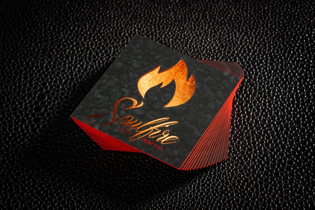
That moment happens because of cardstock. Not because of the design. Not because of the printed name. It happens before anyone has read a word on the card. The hand registers what the eye hasn’t processed yet. The body decides, instantly, what kind of business this person represents.
This is what most articles about business card cardstock miss. They talk about thickness in points. Then they talk about weight in GSM. They list paper types and tell you to pick one. None of them tell you what premium actually feels like in the hand. So that’s what this article is about. I have been building business cards in my own facility for 28 years. What I am about to describe is the gap between what the industry calls premium business card cardstock and what premium actually is when your fingers find it.
It Is Just Thick. Nothing More.
First, consider this. If you pick up a “premium” 32pt business card from one of the large online printers, the kind sold as Ultra Thick or Premium Plus or Luxe, what does your hand tell you?
It tells you that it is thick. Nothing more.
That seems like an upgrade. Compared to a standard 14pt card, it absolutely is. The reader thinks: Oh, this is thicker than normal. Maybe it’s premium. And they hand back a card that fits perfectly with that description: thicker than normal. Premium because nothing else nearby is thicker.
What “Premium” Really Means
But thickness is just one variable. For example, there is texture. There is finish on the surface and finish on the edge. There is what happens when your thumb runs across the corner. Does it catch on a velvet pull, or does it skim across smooth uncoated paper? There is the question of what is inside the card.
The reason most people accept “thicker than normal” as premium is the same reason anyone accepts a ceiling. They have never held the thing that sits above it. If in 1990 you had a flip phone, you would have thought that was the most wonderful invention. The coolest thing. You would have been proud to have one. You would not have known a smartphone was 1,000× better, because no one had handed one to you yet.
In the same way, premium business card cardstock works on this principle. Unless there is a comparison, you wouldn’t know. Therefore, let’s set up the comparison.
The Standard Weight Ladder: What the Industry Calls Premium
Notably, the business card paper market sells itself in two units of measurement that describe the same card from different angles.
GSM stands for grams per square meter. It is a weight measurement, recording how heavy a square meter of the paper is. Higher GSM means denser, sturdier paper.
Pt stands for points, which measure thickness in thousandths of an inch. Higher Pt means a thicker card.
However, the two do correlate but are not identical. As a rough conversion: 300 GSM is roughly 14pt. 350 GSM is roughly 16pt. 600 GSM is roughly 32pt. The industry uses both numbers, essentially, because some buyers think in weight and some think in thickness.
Standard Paper Weight Ladder
Here is the standard weight ladder you will see on almost every premium printer’s site:
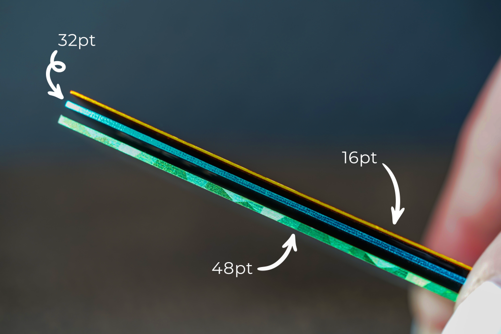
- 14pt (about 300 GSM). The industry default. Sturdy enough to feel intentional. The card most people hand out.
- 16pt (about 350 GSM). One step up. Often described as “premium” by online printers. Roughly the thickness of a credit card edge.
- 18pt (about 400 GSM). Sometimes sold as “ultra” or “super.” Heavier in the hand. Where the standard premium ladder stops for most printers.
- 32pt (about 600 GSM). The thickness of an actual credit card. Where the language switches to “luxury” or “luxe.”
- 48pt. Roughly the limit of what comfortably fits in a wallet. Rare. Sold as a statement piece by the printers that offer it.
Typically, if you are reading articles about business card paper, you will see most of them stop here. Most articles list these weights. These articles tell you 14 to 16pt is fine for most situations and 32pt is for “luxury” use. Some even mention Mohawk Superfine by name as the gold-standard premium paper. They tell you about matte, gloss, satin, and soft-touch laminate finishes. They warn you that thicker isn’t always better because 48pt cards may not fit in a wallet slot.
Everything they tell you is correct, as far as it goes. However, it stops short of the thing that actually matters: what is happening inside the card.
What Happens Inside a 32pt Business Card
Now, here is the part nobody talks about.
Most “premium” online printers sell you a 32pt business card built a single way. They buy sheets of paper already 32pt thick from a paper mill. That sheet typically comes from Mohawk Superfine or an equivalent fine-paper supplier. Their entire production process is straightforward. They take the pre-manufactured 32pt sheet, run it through their press, and print on it.
Essentially, that is the full extent of what is happening. The card is the paper. That paper is whatever the mill produced. The printer’s job is to put ink on it.
This is the silent gap nobody is discussing. The reader holding that card feels the thickness. But they do not realize that the surface they are touching is the surface the mill made. Beneath that surface is more of the same uncoated paper, untreated and bare. No suede lamination, no silk lamination, no linen finish. At 32pt and above, the standard industry default is mill paper. The mill paper is printable only, with no lamination treatments possible on the layers.
What SilkCards Does Instead
Here is what SilkCards does instead.
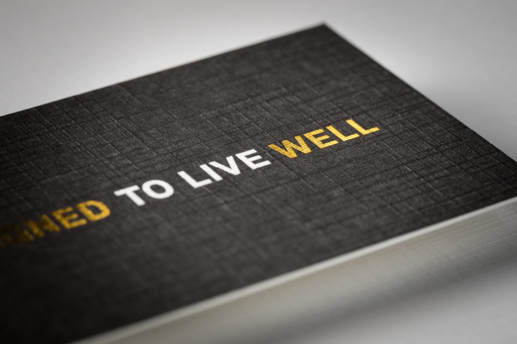
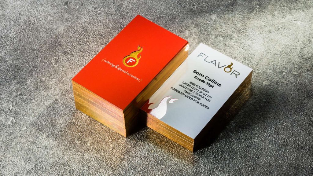
We architecturally build the paperstock. Starting with raw 16pt base sheets, we dress every one of them. We apply suede lamination, silk lamination, or linen finish before we bond any sheets together. Specifically, a SilkCards 32pt card is two fully dressed 16pt sheets bonded into one card. Similarly, a 48pt is three. As a result, every layer carries the same surface finish. There is no bare paper anywhere in the build.
As a result, what that means for your hand is this. When your finger lands on the edge of one of our cards, it touches dressed material continuing all the way through. When your finger lands on the edge of a competitor’s “premium” 32pt card, it touches uncoated paper core. That is the part the printer didn’t put ink on, because the surface treatment ended at the surface.
Why Our Build Unlocks More Options
This is also why our process unlocks treatments others cannot offer. Because we build the card from individual sheets, we can die cut layers independently. We cut through one layer to reveal the color or texture of the layer beneath. Foil can be placed between the layers. We can layer cards three or four sheets thick when a project requires it. What others perform as their entire production process is just the beginning of ours. After bonding comes laser die-cutting, then curing, then finishing the bonded stack. That is the difference between a custom-built premium card and one that is, as I think of it, store bought as is.
To summarize, the standard “premium” business card in 2026 is 14pt to 16pt, or 300 to 350 GSM. The lamination ends at the surface. True premium begins at 32pt, but only when the lamination continues through every layer.
The Five Things a Trained Eye Looks for First
If you handed me any business card right now — a stranger’s, a competitor’s, anyone’s — and gave me five seconds to evaluate it, here is what I would look at, in order. This is the same checklist I use to hold our own production team accountable. We train our QC team to spot the obvious production flaws and the subtle ones. That includes flaws in the customer’s original file setup that made the print come out wrong.
Moreover, you can use this checklist on any card you receive. It will quickly tell you whether the printer used premium equipment or commodity equipment.
The Five-Second Evaluation
- Thickness. The first signal the hand registers. Not because thicker is automatically premium, but because a card that bends easily when picked up has already failed the first impression. The card should feel firm. Stable. Confident in its own form.
- Registration of the print work. Pull the card close. Look at the alignment of every printed element: text, logos, color blocks. On a premium press, the image lands exactly where the file specifies, on every card in the run. On commodity equipment, you see small misalignments, off-center placement, color blocks that drift fractionally past their borders.
- The cuts around the border. Look at the four edges. A premium card has a clean, sharp, perfectly perpendicular cut. A commodity card has subtle inconsistencies: slight ragged edges, micro-fraying, corners that are not quite 90°.
- Any treatment options applied. Foil, spot UV, embossing, debossing, edge painting. How well are they executed? Does the foil lie flat and reflect light cleanly, or does it show micro-bubbling along the edges? Does the spot UV sit at the precise depth the design intended? These details reveal what the press is capable of.
- Edge treatment and visible flaws. Inspect the four edges and the four corners. Look for delamination, any sign of a layer pulling away from the one beneath it. Check for visible glue lines. Also check for color seepage at the edge where the paint or ink crossed beyond where it should have stopped.
How to Use the Checklist
In short, five seconds and five checks will tell you almost everything you need to know about who made the card.
When the Card Speaks for the Business: A Status Seeker’s Perspective
Specifically, most business owners I work with — realtors, attorneys, financial advisors, CEOs — share one truth. Their first move in a room is handing over a card. What that card communicates in the half-second before anyone reads the name on it determines the conversation that follows.
Importantly, I am not making that claim from theory. I am making it from watching what people actually do when they receive one of our cards. The step back. Then the second look. The fingers running across the surface and along the edge. The smile that comes before any words are spoken.
What Clients Actually Say
Customers describe the experience in their own words.
For instance, the silk finish gives the card a soft premium feel.
Verified Trustpilot Reviewer · trustpilot.com/review/silkcards.com
Indeed, the quality is outstanding, and the cards feel luxurious and distinctive.
Verified Trustpilot Reviewer · trustpilot.com/review/silkcards.com
These cards are incredibly sturdy and unique in both shape and color. I can confidently say I’ll never go back to using traditional business cards.
Verified Trustpilot Reviewer · trustpilot.com/review/silkcards.com
What changes for the professional handing the card over is the moment before the conversation starts. The recipient’s eye contact lifts. Their posture shifts. They engage from a position of curiosity rather than dismissal. In that half-second, the card has communicated something about the business. Words would have taken five minutes to establish the same thing.
Ultimately, this is the outcome cardstock makes possible. Not because thickness alone delivered it. Because every variable of the sensory experience, working in concert, told the receiver: this person is serious about what they do.
Common Mistakes, and the One Pain Customers Don’t Know to Mention
After 28 years, I have spoken with many prospects at trade shows and in meetings. When they describe what frustrated them about their previous printer, they almost never name thin or flimsy cards as the problem. They didn’t know to complain about that. The customer doesn’t know to ask for a finish that continues through every layer. No one has shown them what that feels like.
What they do tell me, repeatedly, is something different. They tell me they kept hitting capability issues. Their design was one they were proud of, but their printer couldn’t execute it the way they imagined it. They wanted a specific finish on a specific area of the card. The printer told them it wasn’t possible. They wanted to combine foil with a particular substrate. The printer told them to pick one or the other. They felt creatively restricted by what their printer could deliver.
That is the pain customers know to mention: creative ceiling. When a designer pushes a printer beyond standard capability and the printer cannot follow, that frustration registers and gets voiced.
The Pain Nobody Knows to Mention
The other pain goes unmentioned. It is the silent gap between what they accepted as “thick and premium” and what they didn’t know existed above it. That pain doesn’t generate a complaint because the customer doesn’t have the comparison yet. It generates something else: a quiet underperformance of every handover, every introduction, every first impression. That card was fine. It was thicker than normal. But it just didn’t change the conversation.
If your existing business card is doing its job adequately, that is not the same as a premium card’s job. In short, adequate cards make adequate first impressions. They do not get a second look.
Frequently Asked Questions
The standard “premium” business card in 2026 is 14pt to 16pt (300 to 350 GSM). True premium begins at 32pt (approximately 600 GSM or 0.813 mm, the same thickness as a credit card edge). At 32pt and above, what matters more than the thickness number is whether the lamination continues through every layer or stops at the surface. A 32pt card with surface treatment only is not equivalent to a 32pt card with finish on every interior layer.
No. A 32pt business card is approximately 0.813 mm thick, almost exactly the thickness of a standard credit card. It fits in any card slot in any standard wallet. 48pt cards are roughly the thickness of one and a half credit cards stacked, and they may begin to feel substantial in a wallet slot but still fit in most. Above 48pt, wallet fit becomes a real consideration, which is why most premium business cards stop at 32 to 48pt.
More Frequently Asked Questions
GSM (grams per square meter) measures the weight of the paper, how heavy a square meter of it is. Pt (points, thousandths of an inch) measures the thickness of the paper. They describe the same card from different angles. As a rough conversion: 300 GSM equals approximately 14pt. 350 GSM is roughly 16pt. 600 GSM is roughly 32pt. Most printers use both measurements interchangeably.
Additional Questions
Suede lamination is a soft-touch matte finish applied over the card surface. It produces a velvet-like tactile signature that the hand registers immediately. Silk lamination is a smoother satin-finish version of the same lamination family, slightly more polished and slightly less velvet. Both protect the card and produce a premium feel. The critical distinction for thicker cards: in SilkCards’ construction, suede or silk lamination is applied to every layer of the build, not only the surface. The interior layers carry the same finish as the surface, so the lamination continues all the way through the card.
In five seconds, check these five things in order: (1) thickness, does the card feel firm and stable, or does it bend; (2) registration of the print work, is every printed element exactly where it should be on every card; (3) the cuts around the border, are the edges clean, sharp, perpendicular; (4) any treatment options applied, is the foil, spot UV, or embossing executed cleanly without flaws; (5) edge treatment and visible flaws, any delamination, glue lines, or color seepage. These are the same checks a 28-year print manufacturer runs on cards every day.
Why It Matters: A Note from the Press Floor
I want to close with something personal, because the rest of this article is about cardstock and this part is about why I have spent 28 years caring about it.
Personally, I was brought up to be passionate about whatever I chose to do. When you decide on something, do it with passion. Do something that speaks for you and not something that follows the status quo. Make your own status quo.
In 28 years, I went from designing logos, to print brokering, to owning my own production facility. At every stage I tried to set myself apart by doing the work with that level of passion. Here is one example. Early on I took a $75 design job for a saxophone musician’s logo. It wasn’t just a logo job. I drove from my office to my client several times, thirty minutes each way through Chicago traffic. I went to one of his solo gigs so I could hear his music and understand how the logo needed to feel. That is what passion looks like in practice, and it is not about the money.
Why This Standard Matters to Us
I carried that into printing when I built the facility. The reason SilkCards cardstock is constructed the way it is, with every layer dressed, every edge finished, every detail accountable to a five-second visual test, is the same reason I drove across Chicago to hear a saxophone gig for a $75 logo. Go out of your way to help your customer achieve greatness. That is how I achieve my own.
If your business card is the first move you make in a room, it deserves to be built that way too.
Ready to feel the difference yourself?
Order a free SilkCards sample kit. Feel 32pt suede lamination, raised foil, painted edges, and our full finish range in your own hand. Decide for yourself what premium cardstock actually feels like.