When asked to describe a business card, most people have a pretty clear image in mind ― white card stock, a serif font, maybe a watermark. That’s because the average, run-of-the-mill business card hasn’t changed much over the past century or so.
That’s all starting to change. In recent years, innovative minds in design and marketing have changed the whole game, first by introducing bold visual effects and color palettes to business cards, then by swapping out the card stock entirely for non-traditional base materials.
Why Use Plastic Business Cards?
Using uncommon materials like plastic in your card design will transform the experience of receiving that card. By subverting expectations, you garner attention when it matters most, in those first critical minutes when a strong impression is made.
Plastic cards have a weight and texture that stands out in a way that’s immediately apparent — even in the dark! The plastic used to make these cards is hefty, smooth, and rigid, which creates a tactile experience that feels a lot like a driver’s license or credit card (two things your brain is trained to hold onto and remember).
Plus, plastic cards won’t get mangled in a recipient’s pocket or wallet, and don’t get worn and ugly with age. They’re are also waterproof, making them a standout option for nautical retailers and other people who buy and sell near the water.
What other material options are available to you? Read more about our favorite business card bases.
However, designing a plastic card can be tricky. There’s the risk that you’ll create something that resembles a gift card rather than a bold marketing tool. How do you make the experience of receiving the card something special?
Add color!
Non-traditional business cards need bold stylistic choices to really pop. Nowhere is that more apparent than the colors you choose. Make a big splash!
Use foil on plastic
Plastic cards can come with a glossy or frosted matte plastic finish. Whichever you select, remember to give it a little extra flash with an eye-catching foil shine. You can use foil to touch up logos and text.
Add a silk finish to elevate the look and feel of your cards
If you are choosing plastic for your business cards, consider adding a silk finish to give the card a refined texture that distinguishes it from other plastic cards, like gift cards and calling cards. This is a simple way to have your card stand out from others, and adds a sense of professionalism that can sometimes be lost with a more basic plastic look.
Also consider drawing attention to key areas of your card by adding pops of spot UV to give the card multiple textures and an eye-catching design.
Add frosted glass-like luxury
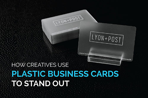
When you elect to use a translucent background, your logos, text, and other design elements that you choose stand for themselves.
Clear plastic cards come with a luxurious, almost futuristic look and feel. You can create a look as crisp and clean as glass — a striking and unique way to frame your information like a plaque.
Think of how materials communicate your branding
Different materials come preloaded with socially-constructed context. For a lot of people, wood signifies outdoorsy, a rustic quality, or ruggedness. Pillowy letterpress paper has entirely different associations. A cupcake shop that presents a stack of glimmering metal business cards on their counter is saying something about themselves.
With this in mind, think about the creative ways that you can use plastics to express uniqueness your branding. A clear plastic card base could be used to create a business card adorned with see-through glasses for an optometrist, a functional slide rule for contractors, or even mimic a viewfinder for a camera shop.
Take your design to the absolute limits of creativity with plastic business cards.

