Imagine networking or going out on Saturday night, and someone asks, “What do you do for a living?” and you stand there with no card to give them. However, there are worse things, like explaining what you do and not having a business card to back it up. It looks unprofessional and allows that person to walk away unimpressed and forget most of what you said. In this article, we’ll discuss designing a business card for beginners: what you need to know, so you’re never in the situation of having nothing to hand someone.
Why Business Cards Matter
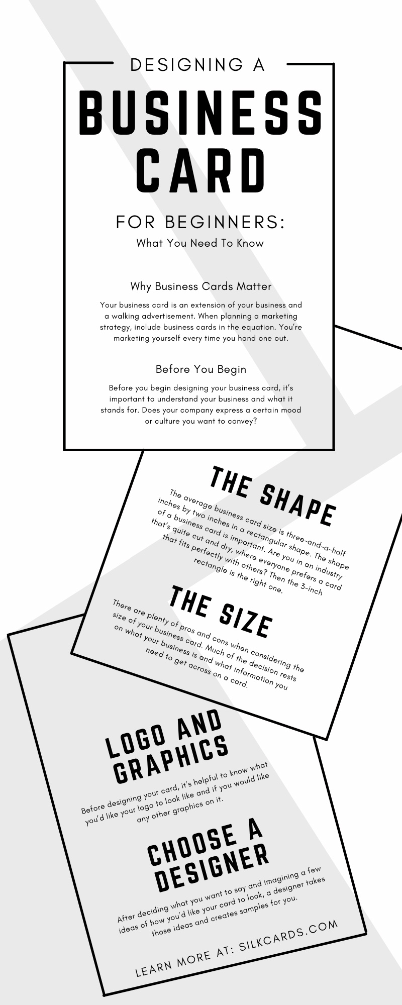
Your business card is an extension of your business and a walking advertisement. When planning a marketing strategy, include business cards in the equation. You’re marketing yourself every time you hand one out.
If created properly, the business card reflects the style and tone of your business. That tiny card states your company’s culture, how you can serve others, and where to reach you. As a businessperson, you don’t want to leave home without a stack of cards.
Business cards also help others take you seriously. You can talk all day long about what you do, but it means little if you can’t back it up not only with proof but with a little effort as well. As you hand someone your card, you’re saying, my service is here when you need it, and I take what I do seriously.
Before You Begin
Before you begin designing your business card, it’s important to understand your business and what it stands for. Sure, you know what your business is about, but is it easily seen by others? Does your company express a certain mood or culture you want to convey? Is it serious, fun, casual, or elegant? When someone holds that business card in their hand and reads it, they’ll quickly come to these conclusions. Understand how you want your card to represent you, and begin designing.
The Shape
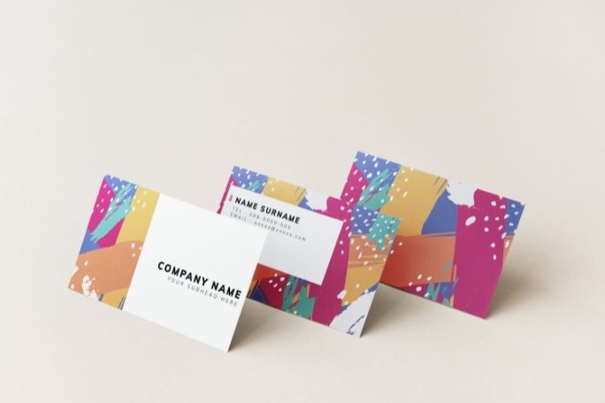
The average business card size is three-and-a-half inches by two inches in a rectangular shape. The size works well, but did you know you can have a business card unique from all those little rectangles? The shape of a business card is important. Are you in an industry that’s quite cut and dry, where everyone prefers a card that fits perfectly with others? Then the 3-inch rectangle is the right one. However, if your business centers around cutting-edge design and the latest trends, shouldn’t your business card also? Virtually every shape is possible with a business card; you need a designer willing to get creative.
The Size
Like the shape, business cards aren’t always the standard size. There are a few things to consider when choosing the size of your business card:
- The country you’ll use it in matters. Countries have many different standard-sized business cards. As mentioned, it’s three-and-a-half by two inches in the US; however, other countries vary.
- What do you need it to say? As you design your card, certain areas are considered safe for your text, logo, and images. The areas on the card are the bleed area, trim area, and safety area. You may need a larger card design if you can’t fit all you need in the safety zone.
- How badly do you want it to stand out? A big card that screams call me first may work well for marketing and is harder to lose. Still, some find a bigger card harder to store.
There are plenty of pros and cons when considering the size of your business card. Much of the decision rests on what your business is and what information you need to get across on a card.
Logo and Graphics
Before designing your card, it’s helpful to know what you’d like your logo to look like and if you would like any other graphics on it. Your logo plays a big role in how others view the tone and style of your business, so choose wisely and make it pop.
The Text
Likely, you have a lot you’d like to say on your business card, but you can’t say it all. It’s like having five seconds to explain to someone what you do and how your service can improve their lives. That’s a bit of pressure. Jot down what you want your business card to tell others, then start narrowing it down into a realistic phrase or two for your business card.
Special Finishes
There are several special finishes to show that you care enough to create something special. Here’s a look at a few favorite special finishes:
- Embossing gives a raised look to the text, giving a business card an extra pop.
- Letter pressing works the opposite way, giving the text an indented look as though engraved.
- Spot UV coating gives cards a varnish type finish only in certain areas, which is useful for highlighting a logo or any other important spot.
- Foil Stamping creates a reflective and shiny surface (imagine tin foil) and is also great for logos.
Choose a Designer
With all the possibilities, creating the perfect business card is a smoother job when using a professional designer. After deciding what you want to say and imagining a few ideas of how you’d like your card to look, a designer takes those ideas and creates samples for you. They often run with your idea and turn it into something greater than you could have imagined. Seeing your vision come to life is an exciting part of the process.
Now that you understand everything you need to know about designing a business card, it’s time to get brainstorming. Decide who you are and what your service stands for, then contact a designer and get rolling.
At Silk Cards, designing the perfect business card is our passion. We don’t quit until your vision is complete. We offer unique services such as laser cut business cards, several shapes and sizes, and special finishes. Contact Silk Cards today, and let’s make your vision a reality.


