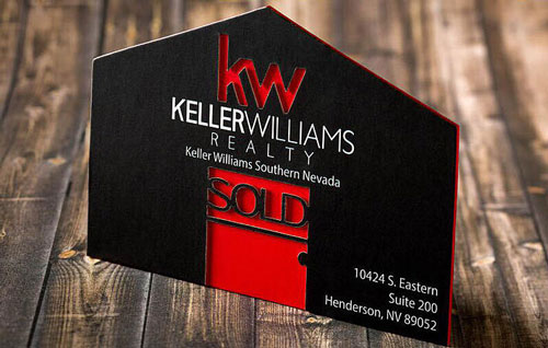
There are some industries where there’s not as much face-to-face networking that’s required, and then there are industries where it’s ALL face-to-face networking. Real estate happens to be one of those ones where you need to meet people, you need to make a great first impression, and you need to have a great business card. We decided to spotlight this amazing REALTOR business card and the amazing REALTOR who wields it everyday, Lysandra Bailen!
Related: 17 Real Estate Business Cards That Close Deals
SILKCARDS Customer Spotlight: Lysandra Bailen
Here’s what Lysandra had to say about her experience working with us:
How long have you been a customer of SILKCARDS?
Actually, before I was a licensed REALTOR, I ordered the cards. I didn’t know how long it was going to take, and I wanted to have them ready. I started… I think it must’ve been back in September.
What made it a priority to order your cards so soon?
For me, it really was about branding myself right out of the gate. I don’t know if I’ll renew my more affordable cards because I get more interactivity from my SILKCARDS. If I run into people I’ve previously met at an open house, they remember me based on, “You’re the one who has the cool cards.”
Related: Real Estate Marketing: Top Ways to Build Your Client List
We know that one of the big challenges for real estate agents is standing out from other individuals in the field. How do your cards compare to others’?
Well, I think I get a lot of the little cheap cards from other agents, the thin ones with the number and the headshot. Mine is more memorable because it’s so thick. The die-cut with the multiple layers, it’s the weight of the card that speaks to people. “Oh wow, this is not like a normal business card!” I do get a lot of questions about the card itself.
Related: 5 Ways to Stand Out from Other Real Estate Agents
I love the concept behind your card. Did you come up with the design, or did SILKCARDS develop your card?
It was kind of a collaboration of both. I drew it out on a sketchpad on my computer, and I said what I wanted, and I sent it to the design team. What they sent back was incredible. I thought it was amazing how they could take what I sent them (Let’s get real, I’m not an artist), and I could see what came back. My husband said my original design was like a child’s drawing! [Laughs]

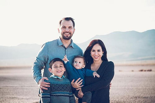
Lysandra and her beautiful family
How was your experience working with the SILKCARDS team?
It was much faster than I thought it would be. Had the first concept back within 24 hours. I made suggestions, and they came back with several options. UV here, font here, laser cut door, etc. They had me change one thing to avoid the card looking too busy. We had everything nailed down within a week before it went into production. I didn’t expect it to be something that just happens overnight because I knew there would be a lot of back and forth.
Related: Are Unique Tactile Business Cards the New Norm?
Would you say that they effectively represent your brand or the feeling you want people to have about your brand?
Yeah, I definitely think so. Based on the reactions I’ve had from it. I wanted to have a clean aesthetic that people remembered, and it definitely came out that way. What’s interesting about that is that since then, I’ve tried to brand myself based on those cards in that way because it’s been so effective so far. If it’s not broke, don’t fix it, right?


